# EXAMPLE CODE FOR REGRESSION & AOV


# read in data
x<-c(20,16,34,23,27,32,18,22)
y<-c(64,61,84,70,88,92,72,77)

mymodel <- lm(y~x) # run regression model
summary(mymodel)  # output

dat1 <- data.frame(x,y) # combine x and y into an R data frame

ss <- aov(y~x, data = dat1) # conduct analysis of variance & save results as 'ss'
summary(ss)  # print results

# to read the output you must realize that the row 'x' gives you the SSR & MSR
# the row 'Residuals' gives tyou SSE & MSE
# SST is not given but you know the formula to get it SST = SSR + SSE


# based on output, calculate SST = SSR + SSE

SST <- 658.5 + 227.5
print(SST) # this gives you SST

#  use this info to calculate R-square = SSR / SST

658.5/SST # gives .743 which was given in the original regression output

# verify that the F- stat is MSR / MSE based on the output from summary(ss)

F<- 658.5/37.92
print(F) # this gives the same results as summary(ss)
Showing posts with label R Code. Show all posts
Showing posts with label R Code. Show all posts
Sunday, May 1, 2011
R Code Example for Linear Regression and Analysis of Variance

Thursday, March 10, 2011
R Code Example for Google Visualization Chart
# ------------------------------------------------------------------
# | PROGRAM NAME: googleVis_R
# | DATE: 1/12/11
# | CREATED BY: Matt Bogard
# | PROJECT FILE:
# |----------------------------------------------------------------
# | PURPOSE: Tutorial for creating Motion Charts in R with the GoogleVis package
# |
# |
# |
# |------------------------------------------------------------------
# | COMMENTS: See the following references for more details
# |
# | 1: http://blog.revolutionanalytics.com/2011/01/create-motion-charts-in-r-with-the-googlevis-package.html
# | 2: http://stackoverflow.com/questions/4646779/embedding-googlevis-charts-into-a-web-site/4649753#4649753
# | 3: http://cran.r-project.org/web/packages/googleVis/googleVis.pdf
# | 4: for more info on accessing the google API and data format requirements:
# | http://code.google.com/apis/visualization/documentation/gallery/motionchart.html#Data_Format
# |
# |
# |------------------------------------------------------------------
# | DATA USED: via google & iris data set
# |
# |
# |------------------------------------------------------------------
# | CONTENTS:
# |
# | PART 1: motion chart using googleVis data
# | PART 2: motion chart using your own data- this case
# | the well know iris data set (a default R data set)
# | PART 3:
# | PART 4:
# | PART 5:
# |
# |-----------------------------------------------------------------
# | UPDATES:
# |
# |
# ------------------------------------------------------------------


# *------------------------------------------------------------------*
# | set R working directory- this is where your data file will go
# | with the script for creating the visualization
# *------------------------------------------------------------------*


setwd("C:\\your directory\\R Data")


# *------------------------------------------------------------------*
# | install the googleVis package (as with any package, this only has
# | to be done forthe initial first use
# *------------------------------------------------------------------*

install.packages('googleVis')


# *------------------------------------------------------------------*
# | call the googleVis library
# *------------------------------------------------------------------*


library(googleVis)

# *-----------------------------------------------------------------*
# |
# |
# |
# | PART 1: motion chart using googleVis data
# |
# |
# |
# *------------------------------------------------------------------*


# *------------------------------------------------------------------*
# | create googelVis data object
# *------------------------------------------------------------------*


M <- gvisMotionChart(Fruits, "Fruit", "Year")


# *------------------------------------------------------------------*
# | look at data object- this includes the script that
# | will be used if you want to publish on your web page/blog
# *------------------------------------------------------------------*


print(M)

# *------------------------------------------------------------------*
# | plot the visualization-this command will open your default browser
# | and produce the visualization - this may not work depending on your
# | security and browser settings
# *------------------------------------------------------------------*

plot(M)


# *------------------------------------------------------------------*
# | create the data object that contains everything necessary to create the
# | chart on your web site/blog
# *------------------------------------------------------------------*


M$html$chart

# *------------------------------------------------------------------*
# | save the data object, which is an html file in your R
# | data directory
# *------------------------------------------------------------------*

cat(M$html$chart, file="tmp.html")

# from this point you can open the file in say, notepad++ and copy the
# script into your blog or web page and the motion chare will be functional


# *-----------------------------------------------------------------*
# |
# |
# |
# | PART 2: motion chart using your own data- this case
# | the well know iris data set (a default R data set)
# |
# |
# |
# *------------------------------------------------------------------*


# *------------------------------------------------------------------*
# | take a look at the data
# *------------------------------------------------------------------*

names(iris)
print(iris)


# simulate a time variable and add it to the data set

iris$time <- rep(1:50, 3)
names(iris)

# *------------------------------------------------------------------*
# | create googelVis data object
# *------------------------------------------------------------------*

r <- gvisMotionChart(iris, "Species", "time")

# *------------------------------------------------------------------*
# | look at data object- this includes the script that
# | will be used if you want to publish on your web page/blog
# *------------------------------------------------------------------*

names(r)
print(r)

# *------------------------------------------------------------------*
# | plot the visualization-this command will open your default browser
# | and produce the visualization - this may not work depending on your
# | security and browser settings
# *------------------------------------------------------------------*

plot(r)

# *------------------------------------------------------------------*
# | create the data object that contains everything necessary to create the
# | chart on your web site/blog
# *------------------------------------------------------------------*


r$html$chart

# *------------------------------------------------------------------*
# | save the data object, which is an html file in your R
# | data directory
# *------------------------------------------------------------------*

cat(r$html$chart, file="tmp2.html")
Visualizing Taxes and Deficits II
(flash enabled browser required)
For the simplest visualization, deselect 'trails' and select (checkbox) the variables DEFICIT, INCOME_TAX, TOTAL_REVENUE, SPENDING
For the best visualization, deselect 'trails' under color select 'unique colors' for Size select 'IN_BILLIONS' Select variables DEFICIT, INCOME_TAX, TOTAL_REVENUE
In any case, notice how early on, in the years following cuts in marginal income taxes, total revenues are increasing, revenues from income taxes are increasing, and the DEFICIT IS PLUNGING. All along spending is steadily incresing. Then about 2008 the deficit explodes, both in billions of dollars and as a percentage of GDP as tax revenues start to plunge. Spending also increases dramatically.
It is also interesting to click on the barcode tab (at the top of the chart) and watch the relative size and position of the bars change with respect to revenue, spending, and deficits.
The data source is the CBO Budget/Historical Tables. I'd provide a link but it moves around constantly. Just Google it and did for it and you can find the data. (or see below)
This was produced using the R google Vis package (for example code see here).
This is the format required for the R googleVis package. (I saved it as a csv file)
BUDGET_ITEM YEAR IN_BILLIONS PCT_GDP
CORP_TAX 2003 131.8 34.90604764
CORP_TAX 2004 189.4 45.88989817
CORP_TAX 2005 278.3 87.42060525
CORP_TAX 2006 353.9 142.5975397
CORP_TAX 2007 370.2 230.3657102
CORP_TAX 2008 304.3 667.9837559
CORP_TAX 2009 138.2 9.782782586
DEFICIT 2003 377.585 3.381560093
DEFICIT 2004 412.727 3.507495538
DEFICIT 2005 318.346 2.556790619
DEFICIT 2006 248.181 1.881156674
DEFICIT 2007 160.701 1.15429536
DEFICIT 2008 45.555 0.311849671
DEFICIT 2009 1412.686 9.313594409
INCOME_TAX 2003 793.7 7.108185563
INCOME_TAX 2004 809 6.875159344
INCOME_TAX 2005 927.2 7.446791422
INCOME_TAX 2006 1043.9 7.912529372
INCOME_TAX 2007 1163.5 8.357276253
INCOME_TAX 2008 1145.7 7.84296276
INCOME_TAX 2009 915.3 6.034414557
SPENDING 2003 2159.906 19.34359663
SPENDING 2004 2292.853 19.48545084
SPENDING 2005 2471.971 19.85359409
SPENDING 2006 2655.057 20.12474039
SPENDING 2007 2728.702 19.59992817
SPENDING 2008 2982.554 20.41726451
SPENDING 2009 3517.681 23.19146229
TOTAL_REVENUE 2003 131.8 1.180368977
TOTAL_REVENUE 2004 189.4 1.609586131
TOTAL_REVENUE 2005 278.3 2.235161834
TOTAL_REVENUE 2006 353.9 2.682483135
TOTAL_REVENUE 2007 370.2 2.659100704
TOTAL_REVENUE 2008 304.3 2.083105148
TOTAL_REVENUE 2009 138.2 0.911128692
For the simplest visualization, deselect 'trails' and select (checkbox) the variables DEFICIT, INCOME_TAX, TOTAL_REVENUE, SPENDING
For the best visualization, deselect 'trails' under color select 'unique colors' for Size select 'IN_BILLIONS' Select variables DEFICIT, INCOME_TAX, TOTAL_REVENUE
In any case, notice how early on, in the years following cuts in marginal income taxes, total revenues are increasing, revenues from income taxes are increasing, and the DEFICIT IS PLUNGING. All along spending is steadily incresing. Then about 2008 the deficit explodes, both in billions of dollars and as a percentage of GDP as tax revenues start to plunge. Spending also increases dramatically.
It is also interesting to click on the barcode tab (at the top of the chart) and watch the relative size and position of the bars change with respect to revenue, spending, and deficits.
The data source is the CBO Budget/Historical Tables. I'd provide a link but it moves around constantly. Just Google it and did for it and you can find the data. (or see below)
This was produced using the R google Vis package (for example code see here).
This is the format required for the R googleVis package. (I saved it as a csv file)
BUDGET_ITEM YEAR IN_BILLIONS PCT_GDP
CORP_TAX 2003 131.8 34.90604764
CORP_TAX 2004 189.4 45.88989817
CORP_TAX 2005 278.3 87.42060525
CORP_TAX 2006 353.9 142.5975397
CORP_TAX 2007 370.2 230.3657102
CORP_TAX 2008 304.3 667.9837559
CORP_TAX 2009 138.2 9.782782586
DEFICIT 2003 377.585 3.381560093
DEFICIT 2004 412.727 3.507495538
DEFICIT 2005 318.346 2.556790619
DEFICIT 2006 248.181 1.881156674
DEFICIT 2007 160.701 1.15429536
DEFICIT 2008 45.555 0.311849671
DEFICIT 2009 1412.686 9.313594409
INCOME_TAX 2003 793.7 7.108185563
INCOME_TAX 2004 809 6.875159344
INCOME_TAX 2005 927.2 7.446791422
INCOME_TAX 2006 1043.9 7.912529372
INCOME_TAX 2007 1163.5 8.357276253
INCOME_TAX 2008 1145.7 7.84296276
INCOME_TAX 2009 915.3 6.034414557
SPENDING 2003 2159.906 19.34359663
SPENDING 2004 2292.853 19.48545084
SPENDING 2005 2471.971 19.85359409
SPENDING 2006 2655.057 20.12474039
SPENDING 2007 2728.702 19.59992817
SPENDING 2008 2982.554 20.41726451
SPENDING 2009 3517.681 23.19146229
TOTAL_REVENUE 2003 131.8 1.180368977
TOTAL_REVENUE 2004 189.4 1.609586131
TOTAL_REVENUE 2005 278.3 2.235161834
TOTAL_REVENUE 2006 353.9 2.682483135
TOTAL_REVENUE 2007 370.2 2.659100704
TOTAL_REVENUE 2008 304.3 2.083105148
TOTAL_REVENUE 2009 138.2 0.911128692
Thursday, January 27, 2011
Example: Data Distributions
Given the following data:
240 240 240 240 240 240 240 240 255 255
265 280 280 290 300 305 325 330 340 265
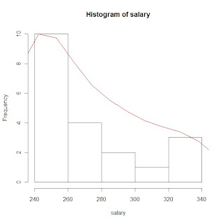
Below is a graphical representation of the distribution for this data. The actual graph is referred to as a histogram, and the green curve is a kernel density estimate, which is an estimation of the probability density function for this data.

The R code used to generate this graph, and to calculate the mean is below:
Created by Pretty R at inside-R.org
240 240 240 240 240 240 240 240 255 255
265 280 280 290 300 305 325 330 340 265
Below is a graphical representation of the distribution for this data. The actual graph is referred to as a histogram, and the green curve is a kernel density estimate, which is an estimation of the probability density function for this data.

The R code used to generate this graph, and to calculate the mean is below:
salary <- c(240, 240, 240, 240, 240, 240, 240, 240, 255, 255, 265, 280, 280, 290, 300, 305, 325, 330, 340, 265)

mean(salary) # calculate the mean

hs <- hist(salary) # plot the distribution - histogram and store
                   # the data about the distribution as the variable hs

d <- density(salary) # calculate the density function for salary

rs <- max(hs$counts)/max(d$y) # resclale the density function so that it can be graphed on the same plot


lines(d$x, d$y*rs, type ="l", col = 51)  # graph the density function for salary
Friday, June 18, 2010
Kernal Density Plots
# When viewing this post the code looks messy, but just copy and paste into
# notepad or the R scripting window and it should line up
# This program is a little more complicated than the previous ones,and some of
# the topics may be a little out of the scope of this class, but if you
# are interested and don't understand something let me know
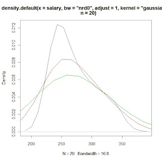
# example plots from Part 2 of the program using sample salary data:
# histogram of salary data with gaussian KDE plot
# KDE plots of salary data with varying bandwidth selections using the 'adjust'
# option
# PROGRAM NAME: KDE_R
# DATE: 6/18/2010
# AUTHOR : MATT BOGARD
# PURPOSE: EXAMPLE OF KERNAL DENSITY ESTIMATES IN R
# DATA USED: SIMULATED WITHIN SCRIPT
# PACKAGES: lattice Hmisc
# OUTPUT FILE: "C:\Documents and Settings\wkuuser\My Documents\TOOLS AND REFERENCES\R References"
# UPDATES:
#
#
# COMMENTS: GIVE A BASIC UNDERSTANDING OF THE density() FUNCTION IN R
# AND BANDWIDTH, KERNAL SELECTION, AND PLOTTING
#
# REFERENCES: ADAPTED FROM
# http://ise.tamu.edu/metrology/Group%20Seminars/Kernel_Density_Estimation_2008JUN27_2.pdf
#
# CONTENTS: PART1 EXAMPLES USING CODE GENERATED NORMALLY DISTRIBUTED DATA
# PART2 EXAMPLES USING SAMPLE DATA
#---------------------------------------------------------------#
# PART1 EXAMPLES USING CODE GENERATED NORMALLY DISTRIBUTED DATA
#---------------------------------------------------------------#
x <- seq(-4, 4, 0.01) y <- dnorm(x, mean=0, sd=1 # create x,y data set that is exactly normal
rn <- rnorm(1000, mean=0, sd=1 # create a set of random normal values
# plot the density of the random numbers you just generated
# let the bandwidth = nrd0 "rule of thub" h= .9*A*n*exp(-1.5), A = min{s,IQR/1.34}
# select the gaussian kernal using 1000 points (which you just generated)
plot(density(x=rn, bw="nrd0", kernel="gaussian", n=1000), col=5) # gaussian is default
lines(x, y) # plot the exactly normal data set you created earlier to compare
# plot a series of KDE plots with varying bandwitdth using 'width='option
# When this option is specified instead of 'bw',and is a number, the density
# function bandwidth is set to a kernel dependent multiple of 'width'
for(w in 1:3)
lines(density(x=rn, width=w, kernel="gaussian", n=1000), col=w+1)
# what if we change the kernal
# first close the graphics window to start over
# look at varius bandwidths using a kernal other than gaussian
# KDE otpions:
# gaussian rectangular triangular
# biweight cosine optcosine"
# epanechnikov
plot(density(x=rn, bw="nrd0", kernel="rectangular", n=1000), col=1)
for(w in 1:3)
lines(density(x=rn, width=w, kernel="rectangular", n=1000), col=w+1)
# or to just look at various densities in one plot
# using a lines statment specifying the specific kernal
plot(density(x=rn, bw="nrd0", kernel="gaussian", n=1000), col=1)
lines(density(x=rn, bw="nrd0", kernel="rectangular", n=1000), col=2)
lines(density(x=rn, bw="nrd0", kernel="triangular", n=1000), col=3)
lines(density(x=rn, bw="nrd0", kernel="epanechnikov", n=1000), col=4)
lines(density(x=rn, bw="nrd0", kernel="biweight", n=1000), col=5)
lines(density(x=rn, bw="nrd0", kernel="cosine", n=1000), col=6)
lines(density(x=rn, bw="nrd0", kernel="optcosine", n=1000), col=7)
# or to just look at various densities in one plot
# using a lines statment specifying the specific kernal
plot(density(x=rn, bw="nrd0", kernel="gaussian", n=1000), col=1)
# note if you want the default gaussian, it does not have to be specified
plot(density(x=rn, bw="nrd0", n=1000), col=1)
#-----------------------------------#
# PART2 EXAMPLES USING SAMPLE DATA
#-----------------------------------#
# load salary data
salary<-c(240,240,240,240,240,240,240,240,255,255,265,265,280,280,290,300,305,325,330,340)
print(salary)
library(Hmisc) # load for describe function
describe(salary) # general stats
library(lattice) # load lattice package for histogram graphics
hs <- hist(salary) # plot histogram and store data
print(hs)
# create a kde of salary data (gaussian)and store it as dens
dens <- density(x=salary, bw="nrd0", n=20)
print(dens)
rs <- max(hs$counts/max(dens$y)) # create scaling factor for plotting the density
lines(dens$x, dens$y*rs, col=2) # plot density over histogram using lines statment
# compare this to just plotting the non-rescaled density over the histogram
lines(density(x=salary, bw="nrd0", n=20),col=3) # green line barely shows up
# also, compare to just plotting the estimated density for the sample
# data in a separate plot
plot(density(x=salary, bw="nrd0", n=20)) # or equivalently
plot(dens, col=3)
# now that we understand the various ways we can plot a specified KDE
# we can apply the tools used in part 1 to look at the effects of
# various bandwidths and kernal choices - first close the graphing window
# what if we change the kernal
# first close the graphics window to start over
# look at varius KDEs
# KDE otpions:
# gaussian rectangular triangular
# biweight cosine optcosine"
# epanechnikov
# look at various densities in one plot
# using a lines statment specifying the specific kernal
plot(density(x=salary, bw="nrd0", kernel="gaussian", n=20), col=1)
lines(density(x=salary, bw="nrd0", kernel="rectangular", n=20), col=2)
lines(density(x=salary, bw="nrd0", kernel="triangular", n=20), col=3)
lines(density(x=salary, bw="nrd0", kernel="epanechnikov", n=20), col=4)
lines(density(x=salary, bw="nrd0", kernel="biweight", n=20), col=5)
lines(density(x=salary, bw="nrd0", kernel="cosine", n=20), col=6)
lines(density(x=salary, bw="nrd0", kernel="optcosine", n=20), col=7)
# what if we don't specify a bandwidth (clear graphics window)
# what is the default density
plot(density(x=salary, bw="nrd0", kernel="gaussian", n=20), col=1)
lines(density(x=salary, kernel="gaussian", n=20), col=2)# nrd0 appears to be default
# what if we change the default
# nrd (a variation of nrd0)
# ucv (unbiased cross validation)
# bcv (cross validation)
lines(density(x=salary, bw="ucv", kernel="gaussian", n=20), col=2)
lines(density(x=salary, bw="bcv", kernel="gaussian", n=20), col=3)
lines(density(x=salary, bw="nrd", kernel="gaussian", n=20), col=4)
# use print option to see how the bw value changes with each method
print(density(x=salary, bw="nrd0", kernel="gaussian", n=20))
# look at the differences in calculated
# bandwidth and plots with the adjust option
for(w in 1:3)
print(density(x=salary, bw="nrd0", adjust=w, kernel="gaussian", n=20))
plot(density(x=salary, bw="nrd0",adjust=1, kernel="gaussian", n=20), col=1)
lines(density(x=salary, bw="nrd0",adjust=2,kernel="gaussian", n=20), col=2)
lines(density(x=salary, bw="nrd0",adjust=3,kernel="gaussian", n=20), col=3)
# notepad or the R scripting window and it should line up
# This program is a little more complicated than the previous ones,and some of
# the topics may be a little out of the scope of this class, but if you
# are interested and don't understand something let me know
# example plots from Part 2 of the program using sample salary data:
# histogram of salary data with gaussian KDE plot

# KDE plots of salary data with varying bandwidth selections using the 'adjust'
# option

# PROGRAM NAME: KDE_R
# DATE: 6/18/2010
# AUTHOR : MATT BOGARD
# PURPOSE: EXAMPLE OF KERNAL DENSITY ESTIMATES IN R
# DATA USED: SIMULATED WITHIN SCRIPT
# PACKAGES: lattice Hmisc
# OUTPUT FILE: "C:\Documents and Settings\wkuuser\My Documents\TOOLS AND REFERENCES\R References"
# UPDATES:
#
#
# COMMENTS: GIVE A BASIC UNDERSTANDING OF THE density() FUNCTION IN R
# AND BANDWIDTH, KERNAL SELECTION, AND PLOTTING
#
# REFERENCES: ADAPTED FROM
# http://ise.tamu.edu/metrology/Group%20Seminars/Kernel_Density_Estimation_2008JUN27_2.pdf
#
# CONTENTS: PART1 EXAMPLES USING CODE GENERATED NORMALLY DISTRIBUTED DATA
# PART2 EXAMPLES USING SAMPLE DATA
#---------------------------------------------------------------#
# PART1 EXAMPLES USING CODE GENERATED NORMALLY DISTRIBUTED DATA
#---------------------------------------------------------------#
x <- seq(-4, 4, 0.01) y <- dnorm(x, mean=0, sd=1 # create x,y data set that is exactly normal
rn <- rnorm(1000, mean=0, sd=1 # create a set of random normal values
# plot the density of the random numbers you just generated
# let the bandwidth = nrd0 "rule of thub" h= .9*A*n*exp(-1.5), A = min{s,IQR/1.34}
# select the gaussian kernal using 1000 points (which you just generated)
plot(density(x=rn, bw="nrd0", kernel="gaussian", n=1000), col=5) # gaussian is default
lines(x, y) # plot the exactly normal data set you created earlier to compare
# plot a series of KDE plots with varying bandwitdth using 'width='option
# When this option is specified instead of 'bw',and is a number, the density
# function bandwidth is set to a kernel dependent multiple of 'width'
for(w in 1:3)
lines(density(x=rn, width=w, kernel="gaussian", n=1000), col=w+1)
# what if we change the kernal
# first close the graphics window to start over
# look at varius bandwidths using a kernal other than gaussian
# KDE otpions:
# gaussian rectangular triangular
# biweight cosine optcosine"
# epanechnikov
plot(density(x=rn, bw="nrd0", kernel="rectangular", n=1000), col=1)
for(w in 1:3)
lines(density(x=rn, width=w, kernel="rectangular", n=1000), col=w+1)
# or to just look at various densities in one plot
# using a lines statment specifying the specific kernal
plot(density(x=rn, bw="nrd0", kernel="gaussian", n=1000), col=1)
lines(density(x=rn, bw="nrd0", kernel="rectangular", n=1000), col=2)
lines(density(x=rn, bw="nrd0", kernel="triangular", n=1000), col=3)
lines(density(x=rn, bw="nrd0", kernel="epanechnikov", n=1000), col=4)
lines(density(x=rn, bw="nrd0", kernel="biweight", n=1000), col=5)
lines(density(x=rn, bw="nrd0", kernel="cosine", n=1000), col=6)
lines(density(x=rn, bw="nrd0", kernel="optcosine", n=1000), col=7)
# or to just look at various densities in one plot
# using a lines statment specifying the specific kernal
plot(density(x=rn, bw="nrd0", kernel="gaussian", n=1000), col=1)
# note if you want the default gaussian, it does not have to be specified
plot(density(x=rn, bw="nrd0", n=1000), col=1)
#-----------------------------------#
# PART2 EXAMPLES USING SAMPLE DATA
#-----------------------------------#
# load salary data
salary<-c(240,240,240,240,240,240,240,240,255,255,265,265,280,280,290,300,305,325,330,340)
print(salary)
library(Hmisc) # load for describe function
describe(salary) # general stats
library(lattice) # load lattice package for histogram graphics
hs <- hist(salary) # plot histogram and store data
print(hs)
# create a kde of salary data (gaussian)and store it as dens
dens <- density(x=salary, bw="nrd0", n=20)
print(dens)
rs <- max(hs$counts/max(dens$y)) # create scaling factor for plotting the density
lines(dens$x, dens$y*rs, col=2) # plot density over histogram using lines statment
# compare this to just plotting the non-rescaled density over the histogram
lines(density(x=salary, bw="nrd0", n=20),col=3) # green line barely shows up
# also, compare to just plotting the estimated density for the sample
# data in a separate plot
plot(density(x=salary, bw="nrd0", n=20)) # or equivalently
plot(dens, col=3)
# now that we understand the various ways we can plot a specified KDE
# we can apply the tools used in part 1 to look at the effects of
# various bandwidths and kernal choices - first close the graphing window
# what if we change the kernal
# first close the graphics window to start over
# look at varius KDEs
# KDE otpions:
# gaussian rectangular triangular
# biweight cosine optcosine"
# epanechnikov
# look at various densities in one plot
# using a lines statment specifying the specific kernal
plot(density(x=salary, bw="nrd0", kernel="gaussian", n=20), col=1)
lines(density(x=salary, bw="nrd0", kernel="rectangular", n=20), col=2)
lines(density(x=salary, bw="nrd0", kernel="triangular", n=20), col=3)
lines(density(x=salary, bw="nrd0", kernel="epanechnikov", n=20), col=4)
lines(density(x=salary, bw="nrd0", kernel="biweight", n=20), col=5)
lines(density(x=salary, bw="nrd0", kernel="cosine", n=20), col=6)
lines(density(x=salary, bw="nrd0", kernel="optcosine", n=20), col=7)
# what if we don't specify a bandwidth (clear graphics window)
# what is the default density
plot(density(x=salary, bw="nrd0", kernel="gaussian", n=20), col=1)
lines(density(x=salary, kernel="gaussian", n=20), col=2)# nrd0 appears to be default
# what if we change the default
# nrd (a variation of nrd0)
# ucv (unbiased cross validation)
# bcv (cross validation)
lines(density(x=salary, bw="ucv", kernel="gaussian", n=20), col=2)
lines(density(x=salary, bw="bcv", kernel="gaussian", n=20), col=3)
lines(density(x=salary, bw="nrd", kernel="gaussian", n=20), col=4)
# use print option to see how the bw value changes with each method
print(density(x=salary, bw="nrd0", kernel="gaussian", n=20))
# look at the differences in calculated
# bandwidth and plots with the adjust option
for(w in 1:3)
print(density(x=salary, bw="nrd0", adjust=w, kernel="gaussian", n=20))
plot(density(x=salary, bw="nrd0",adjust=1, kernel="gaussian", n=20), col=1)
lines(density(x=salary, bw="nrd0",adjust=2,kernel="gaussian", n=20), col=2)
lines(density(x=salary, bw="nrd0",adjust=3,kernel="gaussian", n=20), col=3)
Thursday, April 29, 2010
Standard Normal Distribution & Z-values
############################################
# Below is R code for plotting normal distributions - illustrating
# the changes in the distribution when standard deviation changes.
# -selected graphics are imbedded below
#
# Also calculates area under the normal curve for given Z
#
# Finally plots 3-D bivariate normal density
#
#############################################
# PROGRAM NAME: NORMAL_PLOT_R
#
# ECON 206
#
# ORIGINAL SOURCE: The Standard Normal Distribution in R:
# http://msenux.redwoods.edu/math/R/StandardNormal.php
#
#
#
#
#PLOT NORMAL DENSISTY
x=seq(-4,4,length=200)
y=dnorm(x,mean=0,sd=1)
plot(x,y,type="l",lwd=2,col="red")
#######################################

###################################
# INCREASE THE STANDARD DEVIATION
x=seq(-4,4,length=200)
y=dnorm(x,mean=0,sd=2.5)
plot(x,y,type="l",lwd=2,col="red")
#####################################

####################################
# DECREASE THE STANDARD DEVIATION
x=seq(-4,4,length=200)
y=dnorm(x,mean=0,sd=.5)
plot(x,y,type="l",lwd=2,col="red")
# CALCULATING AREA FOR GIVEN Z-VALUES
# RECALL, FOR THE STANDARD NORMAL DISTRIBUTION THE MEAN = 0 AND
# THE STANDARD DEVIATION = 1
# THE pnorm FUNCTION GIVES THE PROBABILITY FOR THE AREA TO THE LEFT
# OF THE SPECIFIED Z-VALUE ( THE FIRST VALUE ENTERED IN THE FUNCTION)
# THE OUTPUT SHOULD MATCH WHAT YOU GET FROM THE NORMAL TABLE IN YOUR BOOK
# OR THE HANDOUT I SENT YOU
pnorm(0,mean=0, sd=1) # Z =0
pnorm(1,mean=0, sd=1) # Z <= 1
pnorm(1.55, mean=0, sd=1) # Z<=1.55
pnorm(1.645, mean=0, sd=1) # Z<= 1.645
# LETS LOOK AT A BIVARIATE NORMAL
# DISTRIBUTION
# first simulate a bivariate normal sample
library(MASS)
bivn <- mvrnorm(1000, mu = c(0, 0), Sigma = matrix(c(1, 0, 0, 1), 2))
# now we do a kernel density estimate
bivn.kde <- kde2d(bivn[,1], bivn[,2], n = 100)
# now plot your results
contour(bivn.kde)
image(bivn.kde)
persp(bivn.kde, phi = 45, theta = 30)
# fancy contour with image
image(bivn.kde); contour(bivn.kde, add = T)
# fancy perspective
persp(bivn.kde, phi = 45, theta = 30, shade = .1, border = NA)
###############################################

# Below is R code for plotting normal distributions - illustrating
# the changes in the distribution when standard deviation changes.
# -selected graphics are imbedded below
#
# Also calculates area under the normal curve for given Z
#
# Finally plots 3-D bivariate normal density
#
#############################################
# PROGRAM NAME: NORMAL_PLOT_R
#
# ECON 206
#
# ORIGINAL SOURCE: The Standard Normal Distribution in R:
# http://msenux.redwoods.edu/math/R/StandardNormal.php
#
#
#
#
#PLOT NORMAL DENSISTY
x=seq(-4,4,length=200)
y=dnorm(x,mean=0,sd=1)
plot(x,y,type="l",lwd=2,col="red")
#######################################

###################################
# INCREASE THE STANDARD DEVIATION
x=seq(-4,4,length=200)
y=dnorm(x,mean=0,sd=2.5)
plot(x,y,type="l",lwd=2,col="red")
#####################################

####################################
# DECREASE THE STANDARD DEVIATION
x=seq(-4,4,length=200)
y=dnorm(x,mean=0,sd=.5)
plot(x,y,type="l",lwd=2,col="red")
# CALCULATING AREA FOR GIVEN Z-VALUES
# RECALL, FOR THE STANDARD NORMAL DISTRIBUTION THE MEAN = 0 AND
# THE STANDARD DEVIATION = 1
# THE pnorm FUNCTION GIVES THE PROBABILITY FOR THE AREA TO THE LEFT
# OF THE SPECIFIED Z-VALUE ( THE FIRST VALUE ENTERED IN THE FUNCTION)
# THE OUTPUT SHOULD MATCH WHAT YOU GET FROM THE NORMAL TABLE IN YOUR BOOK
# OR THE HANDOUT I SENT YOU
pnorm(0,mean=0, sd=1) # Z =0
pnorm(1,mean=0, sd=1) # Z <= 1
pnorm(1.55, mean=0, sd=1) # Z<=1.55
pnorm(1.645, mean=0, sd=1) # Z<= 1.645
# LETS LOOK AT A BIVARIATE NORMAL
# DISTRIBUTION
# first simulate a bivariate normal sample
library(MASS)
bivn <- mvrnorm(1000, mu = c(0, 0), Sigma = matrix(c(1, 0, 0, 1), 2))
# now we do a kernel density estimate
bivn.kde <- kde2d(bivn[,1], bivn[,2], n = 100)
# now plot your results
contour(bivn.kde)
image(bivn.kde)
persp(bivn.kde, phi = 45, theta = 30)
# fancy contour with image
image(bivn.kde); contour(bivn.kde, add = T)
# fancy perspective
persp(bivn.kde, phi = 45, theta = 30, shade = .1, border = NA)
###############################################

Sunday, April 25, 2010
Basic Regression in R
#
# COMMENTS: BASIC INTRODUCTION TO REGRESSION USING R
#
#
# WILLIAMS P 572 #1
#
# GET DATA
x<-c(1,2,3,4,5)
y<-c(3,7,5,11,14)
# PLOT DATA
plot(x,y)
reg1 <- lm(y~x) # COMPUTE REGRESSION ESTIMATES
summary(reg1) # PRINT OUTPUT
abline(reg1) # PLOT REGRESSION LINE
#
# SCHAUM'S P. 274 #14.2
#
#GET DATA
x<-c(20,16,34,23,27,32,18,22)
y<-c(64,61,84,70,88,92,72,77)
plot(x,y) #PLOT DATA
reg1 <- lm(y~x) # COMPUTE REGRESSION ESTIMATES
summary(reg1) # PRINT OUTPUT
abline(reg1) # PLOT REGRESSION LINE
# COMMENTS: BASIC INTRODUCTION TO REGRESSION USING R
#
#
# WILLIAMS P 572 #1
#
# GET DATA
x<-c(1,2,3,4,5)
y<-c(3,7,5,11,14)
# PLOT DATA
plot(x,y)
reg1 <- lm(y~x) # COMPUTE REGRESSION ESTIMATES
summary(reg1) # PRINT OUTPUT
abline(reg1) # PLOT REGRESSION LINE
#
# SCHAUM'S P. 274 #14.2
#
#GET DATA
x<-c(20,16,34,23,27,32,18,22)
y<-c(64,61,84,70,88,92,72,77)
plot(x,y) #PLOT DATA
reg1 <- lm(y~x) # COMPUTE REGRESSION ESTIMATES
summary(reg1) # PRINT OUTPUT
abline(reg1) # PLOT REGRESSION LINE
Monday, February 1, 2010
R Code for Sample Statistics Problesm
#################################################
# SELECTED PRACTICE PROBLEMS USING R -SCHAUMS
#################################################
# P.49-50
# 3.1
sales<-c(.10,.10,.25,.25,.25,.35,.40,.53,.90,1.25,1.35,2.45,2.71,3.09,4.10)
summary(sales)
sum(sales)
#3.5
salary<-c(240,240,240,240,240,240,240,240,255,255,265,265,280,280,290,300,305,325,330,340)
sum(salary)# just to check your work done by hand
summary(salary)
#---------------------------------
# EXAMPLE OF HISTOGRAM
#---------------------------------
library(lattice)# graphing package
hist(salary) # graph histogram
d <- density(salary) # fit curve to data
plot(d) # plot curve
# 4.9
minutes<-c(5,5,5,7,9,14,15,15,16,18)
print(minutes)
summary(minutes)
var(minutes)
sd(minutes)
library(lattice) # for graphics,but not necessary if previously loaded
hist(minutes)
d<-density(minutes)
plot(d)
#4.24
weights<-c(21,18,30,12,14,17,28,10,16,25)
sum(weights)
summary(weights)
sum(weights*weights) gives sum of X squared
var(weights)
sd(weights)
#4.33
cars<-c(2,4,7,10,10,10,12,12,14,15)
print(cars)
sum(cars)
summary(cars)
sum(cars*cars)
var(cars)
sd(cars)
(4.16866/9.6)*100 #co-efficient of variation
#################################################
# SELECTED PRACTICE PROBLEMS USING R -WILLIAMS
#################################################
#P.107
#1a
sample<-c(10,20,12,17,16)
print(sample)
summary(sample)
#2a
sample<-c(10,20,21,17,16,12)
print(sample)
summary(sample)
#p.151
#61
loans<-c(10.1,14.8,5,10.2,12.4,12.2,2,11.5,17.8,4)
print(loans)
sum(loans)
summary(loans)
sum(loans^2)
var(loans)
sd(loans)
#63
public<-c(28,29,32,37,33,25,29,32,41,34)
print(public)
sum(public)
summary(public)
sum(public^2)
var(public)
sd(public)
(4.64/32)*100 #CV
auto<-c(29,31,33,32,34,30,31,32,35,33)
print(auto)
sum(auto)
summary(auto)
sum(auto^2)
var(auto)
sd(auto)
(1.83/3.33)*100 #CV
# SELECTED PRACTICE PROBLEMS USING R -SCHAUMS
#################################################
# P.49-50
# 3.1
sales<-c(.10,.10,.25,.25,.25,.35,.40,.53,.90,1.25,1.35,2.45,2.71,3.09,4.10)
summary(sales)
sum(sales)
#3.5
salary<-c(240,240,240,240,240,240,240,240,255,255,265,265,280,280,290,300,305,325,330,340)
sum(salary)# just to check your work done by hand
summary(salary)
#---------------------------------
# EXAMPLE OF HISTOGRAM
#---------------------------------
library(lattice)# graphing package
hist(salary) # graph histogram
d <- density(salary) # fit curve to data
plot(d) # plot curve
# 4.9
minutes<-c(5,5,5,7,9,14,15,15,16,18)
print(minutes)
summary(minutes)
var(minutes)
sd(minutes)
library(lattice) # for graphics,but not necessary if previously loaded
hist(minutes)
d<-density(minutes)
plot(d)
#4.24
weights<-c(21,18,30,12,14,17,28,10,16,25)
sum(weights)
summary(weights)
sum(weights*weights) gives sum of X squared
var(weights)
sd(weights)
#4.33
cars<-c(2,4,7,10,10,10,12,12,14,15)
print(cars)
sum(cars)
summary(cars)
sum(cars*cars)
var(cars)
sd(cars)
(4.16866/9.6)*100 #co-efficient of variation
#################################################
# SELECTED PRACTICE PROBLEMS USING R -WILLIAMS
#################################################
#P.107
#1a
sample<-c(10,20,12,17,16)
print(sample)
summary(sample)
#2a
sample<-c(10,20,21,17,16,12)
print(sample)
summary(sample)
#p.151
#61
loans<-c(10.1,14.8,5,10.2,12.4,12.2,2,11.5,17.8,4)
print(loans)
sum(loans)
summary(loans)
sum(loans^2)
var(loans)
sd(loans)
#63
public<-c(28,29,32,37,33,25,29,32,41,34)
print(public)
sum(public)
summary(public)
sum(public^2)
var(public)
sd(public)
(4.64/32)*100 #CV
auto<-c(29,31,33,32,34,30,31,32,35,33)
print(auto)
sum(auto)
summary(auto)
sum(auto^2)
var(auto)
sd(auto)
(1.83/3.33)*100 #CV
Sunday, January 31, 2010
R Code for Basic Histograms
#####################################################
## THIS IS A LITTLE MORE STRAIGHT FORWARD THAN THE ##
## THE OTHER EXAMPLE- USING A SIMPLE DATA SET READ ##
## DIRECTLY FROM R VS. A FILE OR WEB ##
#####################################################
#----------------------------------------#
# SCHAUM'S P. 49 3.5 SALARY DATA
# BASIC HISTOGRAM
#----------------------------------------#
# LOAD SALARY DATA INTO VARIABLE SALARY
salary<-c(240,240,240,240,240,240,240,240,255,255,265,265,280,280,290,300,305,325,330,340) print(salary) # SEE IF IT IS CORRECT library(lattice) # LOAD THE REQUIRED lattice PACKAGE FOR GRAPHICS hist(salary) # PRODUCE THE HISTOGRAM # SEE OUTPUT BELOW
#---------------------------------------
# HISTOGRAM OPTIONS FOR COLOR ETC.
#----------------------------------------
hist(salary, breaks=6, col="blue") # MANIPULATE THE # OF BREAKS AND COLOR
# CHANGE TITLE AND X-AXIS LABEL
hist(salary, breaks=6, col="blue", xlab ="Weekly Salary", main ="Distribution of Salary")
#-------------------------------------------------
# FIT A SMOOTH CURVE TO THE DATA- KERNAL DENSITY
#-------------------------------------------------
d <- density(salary) # CREATE A DENSITY CURVE TO FIT THE DATA
plot(d) # PLOT THE CURVE
plot(d, main="Kernal Density Distribution of Salary") # ADD TITLE
polygon(d, col="yellow", border="blue") # ADD COLOR
## THIS IS A LITTLE MORE STRAIGHT FORWARD THAN THE ##
## THE OTHER EXAMPLE- USING A SIMPLE DATA SET READ ##
## DIRECTLY FROM R VS. A FILE OR WEB ##
#####################################################
#----------------------------------------#
# SCHAUM'S P. 49 3.5 SALARY DATA
# BASIC HISTOGRAM
#----------------------------------------#
# LOAD SALARY DATA INTO VARIABLE SALARY
salary<-c(240,240,240,240,240,240,240,240,255,255,265,265,280,280,290,300,305,325,330,340) print(salary) # SEE IF IT IS CORRECT library(lattice) # LOAD THE REQUIRED lattice PACKAGE FOR GRAPHICS hist(salary) # PRODUCE THE HISTOGRAM # SEE OUTPUT BELOW

#---------------------------------------
# HISTOGRAM OPTIONS FOR COLOR ETC.
#----------------------------------------
hist(salary, breaks=6, col="blue") # MANIPULATE THE # OF BREAKS AND COLOR
# CHANGE TITLE AND X-AXIS LABEL
hist(salary, breaks=6, col="blue", xlab ="Weekly Salary", main ="Distribution of Salary")
#-------------------------------------------------
# FIT A SMOOTH CURVE TO THE DATA- KERNAL DENSITY
#-------------------------------------------------
d <- density(salary) # CREATE A DENSITY CURVE TO FIT THE DATA
plot(d) # PLOT THE CURVE
plot(d, main="Kernal Density Distribution of Salary") # ADD TITLE
polygon(d, col="yellow", border="blue") # ADD COLOR
Saturday, January 30, 2010
R Code for Mean, Variance, and Standard Deviation
##################################################
## REMEMBER, THIS IS ONLY THOSE INTERESTED IN R
## YOU ARE NOT REQUIRED TO UNDERSTAND THIS CODE
## WE WILL WORK THROUGH THIS IN CLASS ON THE BOARD
## AND IN EXCEL
##################################################
#---------------------------------#
# DEMONSTRATE MEAN AND VARIANCE #
#---------------------------------#
###################################
# DATA: Corn Yields
#
# Garst: 148 150 152 146 154
#
# Pioneer: 150 175 120 140 165
###################################
# compute descriptive statistics for Garst corn yields
garst<-c(148, 150, 152, 146, 154) # enter values for 'garst'
print(garst) # see if the data is there
summary(garst) # this gives the mean, median, min, max Q1,Q3
var(garst) # compute variance
sd(garst) # compute standard deviation
plot(garst)
# compute descriptive statistics for Pioneer Corn Yields
pioneer<-c(150, 175, 120, 140, 165)
print(pioneer)
summary(pioneer)
var(pioneer)
sd(pioneer)
plot(pioneer)
## REMEMBER, THIS IS ONLY THOSE INTERESTED IN R
## YOU ARE NOT REQUIRED TO UNDERSTAND THIS CODE
## WE WILL WORK THROUGH THIS IN CLASS ON THE BOARD
## AND IN EXCEL
##################################################
#---------------------------------#
# DEMONSTRATE MEAN AND VARIANCE #
#---------------------------------#
###################################
# DATA: Corn Yields
#
# Garst: 148 150 152 146 154
#
# Pioneer: 150 175 120 140 165
###################################
# compute descriptive statistics for Garst corn yields
garst<-c(148, 150, 152, 146, 154) # enter values for 'garst'
print(garst) # see if the data is there
summary(garst) # this gives the mean, median, min, max Q1,Q3
var(garst) # compute variance
sd(garst) # compute standard deviation
plot(garst)
# compute descriptive statistics for Pioneer Corn Yields
pioneer<-c(150, 175, 120, 140, 165)
print(pioneer)
summary(pioneer)
var(pioneer)
sd(pioneer)
plot(pioneer)
Tuesday, January 5, 2010
Creating a Histogram In R
# READ DATA SET CALLED 'hs0' from Web:
hs0 <- read.table("http://www.ats.ucla.edu/stat/R/notes/hs0.csv", header=T, sep=",")
attach(hs0)
# Or if you have downloaded the data set to your desktop:
hs0 <- read.table("C:\\Documents and Settings\\wkuuser\\Desktop\\hs0.csv", header=T, sep=",")
attach(hs0)
# print summary of first 20 observations to see what the data looks like
hs0[1:20, ]
# CREATE HISTOGRAM FOR VARIABLE 'write'
library(lattice)
hist(write)
hs0 <- read.table("http://www.ats.ucla.edu/stat/R/notes/hs0.csv", header=T, sep=",")
attach(hs0)
# Or if you have downloaded the data set to your desktop:
hs0 <- read.table("C:\\Documents and Settings\\wkuuser\\Desktop\\hs0.csv", header=T, sep=",")
attach(hs0)
# print summary of first 20 observations to see what the data looks like
hs0[1:20, ]
# CREATE HISTOGRAM FOR VARIABLE 'write'
library(lattice)
hist(write)
Subscribe to:
Posts (Atom)
