# EXAMPLE CODE FOR REGRESSION & AOV


# read in data
x<-c(20,16,34,23,27,32,18,22)
y<-c(64,61,84,70,88,92,72,77)

mymodel <- lm(y~x) # run regression model
summary(mymodel)  # output

dat1 <- data.frame(x,y) # combine x and y into an R data frame

ss <- aov(y~x, data = dat1) # conduct analysis of variance & save results as 'ss'
summary(ss)  # print results

# to read the output you must realize that the row 'x' gives you the SSR & MSR
# the row 'Residuals' gives tyou SSE & MSE
# SST is not given but you know the formula to get it SST = SSR + SSE


# based on output, calculate SST = SSR + SSE

SST <- 658.5 + 227.5
print(SST) # this gives you SST

#  use this info to calculate R-square = SSR / SST

658.5/SST # gives .743 which was given in the original regression output

# verify that the F- stat is MSR / MSE based on the output from summary(ss)

F<- 658.5/37.92
print(F) # this gives the same results as summary(ss)
Showing posts with label R. Show all posts
Showing posts with label R. Show all posts
Sunday, May 1, 2011
R Code Example for Linear Regression and Analysis of Variance

Thursday, March 10, 2011
R Code Example for Google Visualization Chart
# ------------------------------------------------------------------
# | PROGRAM NAME: googleVis_R
# | DATE: 1/12/11
# | CREATED BY: Matt Bogard
# | PROJECT FILE:
# |----------------------------------------------------------------
# | PURPOSE: Tutorial for creating Motion Charts in R with the GoogleVis package
# |
# |
# |
# |------------------------------------------------------------------
# | COMMENTS: See the following references for more details
# |
# | 1: http://blog.revolutionanalytics.com/2011/01/create-motion-charts-in-r-with-the-googlevis-package.html
# | 2: http://stackoverflow.com/questions/4646779/embedding-googlevis-charts-into-a-web-site/4649753#4649753
# | 3: http://cran.r-project.org/web/packages/googleVis/googleVis.pdf
# | 4: for more info on accessing the google API and data format requirements:
# | http://code.google.com/apis/visualization/documentation/gallery/motionchart.html#Data_Format
# |
# |
# |------------------------------------------------------------------
# | DATA USED: via google & iris data set
# |
# |
# |------------------------------------------------------------------
# | CONTENTS:
# |
# | PART 1: motion chart using googleVis data
# | PART 2: motion chart using your own data- this case
# | the well know iris data set (a default R data set)
# | PART 3:
# | PART 4:
# | PART 5:
# |
# |-----------------------------------------------------------------
# | UPDATES:
# |
# |
# ------------------------------------------------------------------


# *------------------------------------------------------------------*
# | set R working directory- this is where your data file will go
# | with the script for creating the visualization
# *------------------------------------------------------------------*


setwd("C:\\your directory\\R Data")


# *------------------------------------------------------------------*
# | install the googleVis package (as with any package, this only has
# | to be done forthe initial first use
# *------------------------------------------------------------------*

install.packages('googleVis')


# *------------------------------------------------------------------*
# | call the googleVis library
# *------------------------------------------------------------------*


library(googleVis)

# *-----------------------------------------------------------------*
# |
# |
# |
# | PART 1: motion chart using googleVis data
# |
# |
# |
# *------------------------------------------------------------------*


# *------------------------------------------------------------------*
# | create googelVis data object
# *------------------------------------------------------------------*


M <- gvisMotionChart(Fruits, "Fruit", "Year")


# *------------------------------------------------------------------*
# | look at data object- this includes the script that
# | will be used if you want to publish on your web page/blog
# *------------------------------------------------------------------*


print(M)

# *------------------------------------------------------------------*
# | plot the visualization-this command will open your default browser
# | and produce the visualization - this may not work depending on your
# | security and browser settings
# *------------------------------------------------------------------*

plot(M)


# *------------------------------------------------------------------*
# | create the data object that contains everything necessary to create the
# | chart on your web site/blog
# *------------------------------------------------------------------*


M$html$chart

# *------------------------------------------------------------------*
# | save the data object, which is an html file in your R
# | data directory
# *------------------------------------------------------------------*

cat(M$html$chart, file="tmp.html")

# from this point you can open the file in say, notepad++ and copy the
# script into your blog or web page and the motion chare will be functional


# *-----------------------------------------------------------------*
# |
# |
# |
# | PART 2: motion chart using your own data- this case
# | the well know iris data set (a default R data set)
# |
# |
# |
# *------------------------------------------------------------------*


# *------------------------------------------------------------------*
# | take a look at the data
# *------------------------------------------------------------------*

names(iris)
print(iris)


# simulate a time variable and add it to the data set

iris$time <- rep(1:50, 3)
names(iris)

# *------------------------------------------------------------------*
# | create googelVis data object
# *------------------------------------------------------------------*

r <- gvisMotionChart(iris, "Species", "time")

# *------------------------------------------------------------------*
# | look at data object- this includes the script that
# | will be used if you want to publish on your web page/blog
# *------------------------------------------------------------------*

names(r)
print(r)

# *------------------------------------------------------------------*
# | plot the visualization-this command will open your default browser
# | and produce the visualization - this may not work depending on your
# | security and browser settings
# *------------------------------------------------------------------*

plot(r)

# *------------------------------------------------------------------*
# | create the data object that contains everything necessary to create the
# | chart on your web site/blog
# *------------------------------------------------------------------*


r$html$chart

# *------------------------------------------------------------------*
# | save the data object, which is an html file in your R
# | data directory
# *------------------------------------------------------------------*

cat(r$html$chart, file="tmp2.html")
Visualizing Taxes and Deficits II
(flash enabled browser required)
For the simplest visualization, deselect 'trails' and select (checkbox) the variables DEFICIT, INCOME_TAX, TOTAL_REVENUE, SPENDING
For the best visualization, deselect 'trails' under color select 'unique colors' for Size select 'IN_BILLIONS' Select variables DEFICIT, INCOME_TAX, TOTAL_REVENUE
In any case, notice how early on, in the years following cuts in marginal income taxes, total revenues are increasing, revenues from income taxes are increasing, and the DEFICIT IS PLUNGING. All along spending is steadily incresing. Then about 2008 the deficit explodes, both in billions of dollars and as a percentage of GDP as tax revenues start to plunge. Spending also increases dramatically.
It is also interesting to click on the barcode tab (at the top of the chart) and watch the relative size and position of the bars change with respect to revenue, spending, and deficits.
The data source is the CBO Budget/Historical Tables. I'd provide a link but it moves around constantly. Just Google it and did for it and you can find the data. (or see below)
This was produced using the R google Vis package (for example code see here).
This is the format required for the R googleVis package. (I saved it as a csv file)
BUDGET_ITEM YEAR IN_BILLIONS PCT_GDP
CORP_TAX 2003 131.8 34.90604764
CORP_TAX 2004 189.4 45.88989817
CORP_TAX 2005 278.3 87.42060525
CORP_TAX 2006 353.9 142.5975397
CORP_TAX 2007 370.2 230.3657102
CORP_TAX 2008 304.3 667.9837559
CORP_TAX 2009 138.2 9.782782586
DEFICIT 2003 377.585 3.381560093
DEFICIT 2004 412.727 3.507495538
DEFICIT 2005 318.346 2.556790619
DEFICIT 2006 248.181 1.881156674
DEFICIT 2007 160.701 1.15429536
DEFICIT 2008 45.555 0.311849671
DEFICIT 2009 1412.686 9.313594409
INCOME_TAX 2003 793.7 7.108185563
INCOME_TAX 2004 809 6.875159344
INCOME_TAX 2005 927.2 7.446791422
INCOME_TAX 2006 1043.9 7.912529372
INCOME_TAX 2007 1163.5 8.357276253
INCOME_TAX 2008 1145.7 7.84296276
INCOME_TAX 2009 915.3 6.034414557
SPENDING 2003 2159.906 19.34359663
SPENDING 2004 2292.853 19.48545084
SPENDING 2005 2471.971 19.85359409
SPENDING 2006 2655.057 20.12474039
SPENDING 2007 2728.702 19.59992817
SPENDING 2008 2982.554 20.41726451
SPENDING 2009 3517.681 23.19146229
TOTAL_REVENUE 2003 131.8 1.180368977
TOTAL_REVENUE 2004 189.4 1.609586131
TOTAL_REVENUE 2005 278.3 2.235161834
TOTAL_REVENUE 2006 353.9 2.682483135
TOTAL_REVENUE 2007 370.2 2.659100704
TOTAL_REVENUE 2008 304.3 2.083105148
TOTAL_REVENUE 2009 138.2 0.911128692
For the simplest visualization, deselect 'trails' and select (checkbox) the variables DEFICIT, INCOME_TAX, TOTAL_REVENUE, SPENDING
For the best visualization, deselect 'trails' under color select 'unique colors' for Size select 'IN_BILLIONS' Select variables DEFICIT, INCOME_TAX, TOTAL_REVENUE
In any case, notice how early on, in the years following cuts in marginal income taxes, total revenues are increasing, revenues from income taxes are increasing, and the DEFICIT IS PLUNGING. All along spending is steadily incresing. Then about 2008 the deficit explodes, both in billions of dollars and as a percentage of GDP as tax revenues start to plunge. Spending also increases dramatically.
It is also interesting to click on the barcode tab (at the top of the chart) and watch the relative size and position of the bars change with respect to revenue, spending, and deficits.
The data source is the CBO Budget/Historical Tables. I'd provide a link but it moves around constantly. Just Google it and did for it and you can find the data. (or see below)
This was produced using the R google Vis package (for example code see here).
This is the format required for the R googleVis package. (I saved it as a csv file)
BUDGET_ITEM YEAR IN_BILLIONS PCT_GDP
CORP_TAX 2003 131.8 34.90604764
CORP_TAX 2004 189.4 45.88989817
CORP_TAX 2005 278.3 87.42060525
CORP_TAX 2006 353.9 142.5975397
CORP_TAX 2007 370.2 230.3657102
CORP_TAX 2008 304.3 667.9837559
CORP_TAX 2009 138.2 9.782782586
DEFICIT 2003 377.585 3.381560093
DEFICIT 2004 412.727 3.507495538
DEFICIT 2005 318.346 2.556790619
DEFICIT 2006 248.181 1.881156674
DEFICIT 2007 160.701 1.15429536
DEFICIT 2008 45.555 0.311849671
DEFICIT 2009 1412.686 9.313594409
INCOME_TAX 2003 793.7 7.108185563
INCOME_TAX 2004 809 6.875159344
INCOME_TAX 2005 927.2 7.446791422
INCOME_TAX 2006 1043.9 7.912529372
INCOME_TAX 2007 1163.5 8.357276253
INCOME_TAX 2008 1145.7 7.84296276
INCOME_TAX 2009 915.3 6.034414557
SPENDING 2003 2159.906 19.34359663
SPENDING 2004 2292.853 19.48545084
SPENDING 2005 2471.971 19.85359409
SPENDING 2006 2655.057 20.12474039
SPENDING 2007 2728.702 19.59992817
SPENDING 2008 2982.554 20.41726451
SPENDING 2009 3517.681 23.19146229
TOTAL_REVENUE 2003 131.8 1.180368977
TOTAL_REVENUE 2004 189.4 1.609586131
TOTAL_REVENUE 2005 278.3 2.235161834
TOTAL_REVENUE 2006 353.9 2.682483135
TOTAL_REVENUE 2007 370.2 2.659100704
TOTAL_REVENUE 2008 304.3 2.083105148
TOTAL_REVENUE 2009 138.2 0.911128692
Thursday, January 27, 2011
Example: Data Distributions
Given the following data:
240 240 240 240 240 240 240 240 255 255
265 280 280 290 300 305 325 330 340 265
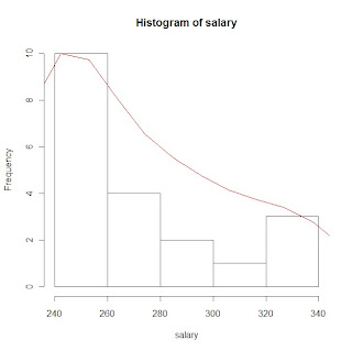
Below is a graphical representation of the distribution for this data. The actual graph is referred to as a histogram, and the green curve is a kernel density estimate, which is an estimation of the probability density function for this data.

The R code used to generate this graph, and to calculate the mean is below:
Created by Pretty R at inside-R.org
240 240 240 240 240 240 240 240 255 255
265 280 280 290 300 305 325 330 340 265
Below is a graphical representation of the distribution for this data. The actual graph is referred to as a histogram, and the green curve is a kernel density estimate, which is an estimation of the probability density function for this data.

The R code used to generate this graph, and to calculate the mean is below:
salary <- c(240, 240, 240, 240, 240, 240, 240, 240, 255, 255, 265, 280, 280, 290, 300, 305, 325, 330, 340, 265)

mean(salary) # calculate the mean

hs <- hist(salary) # plot the distribution - histogram and store
                   # the data about the distribution as the variable hs

d <- density(salary) # calculate the density function for salary

rs <- max(hs$counts)/max(d$y) # resclale the density function so that it can be graphed on the same plot


lines(d$x, d$y*rs, type ="l", col = 51)  # graph the density function for salary
Wednesday, July 14, 2010
Using R
Many people that are involved in data analysis may have one software package that they prefer to use, but may never have heard of R, or even thought about trying something new. R is a statistical programming language with a command line interface that is becoming more and more popular every day. If you are used to a point and click interface (like SPSS or Excel for example) the learning curve for R may be quite steep but well worth the effort. If you are already familiar with a programming language, like SAS for instance, (SPSS also has a command line interface) the switch to R may not be that difficult but could be very rewarding. In fact there is a free version of a reference available entitled ‘R for SAS and SPSS Users’ that I found very helpful getting started.
How I use R
I often use SAS for data management, recoding, merging and sub-setting data sets, and cleaning and formatting data. I’m getting better at doing some of these things in R but I just have more experience in SAS. I first became interested in using R for spatial lag models and geographically weighted regression, which requires the construction of spatial weights matrices. (These techniques aren't as straight forward if at all possible in SAS). I've also used R for data visualization, data mining/machine learning, as well as social network analysis. I give my students the option to use R in the statistics course I teach and I have had several pursue it. And most recently, I have become acquainted with SAS IML Studio, which is a product that will better enable me to integrate some of my SAS related projects with some of the powerful tools R provides.
How can you use R?
Google’s Chief Economist Hal Varian uses R . His paper Predicting the Present with Google Trends is a great example of how R can be used for prediction, and is loaded with R code and graphics. Facebook uses R as well:
“Facebook’s Data Team used R in 2007 to answer two questions about new users: (i) which data points predict whether a user will stay? and (ii) if they stay, which data points predict how active they’ll be after three months?” (Link- how Google and Facebook are using r by Michael E. Driscoll at Dataspora.com)
The New York Times recently did a feature on R entitled ‘Data Analysts Captivated by R’ where industry leaders explain why and how they use R.
“Companies like Google and Pfizer say they use the software for just about anything they can. Google, for example, taps R for help understanding trends in ad pricing and for illuminating patterns in the search data it collects. Pfizer has created customized packages for R…Companies as diverse as Google, Pfizer, Merck, Bank of America, the InterContinental Hotels Group and Shell use it.”
The article goes on to discuss the proliferate and diverse packages offered by R:
“One package, called BiodiversityR, offers a graphical interface aimed at making calculations of environmental trends easier. Another package, called Emu, analyzes speech patterns, while GenABEL is used to study the human genome. The financial services community has demonstrated a particular affinity for R; dozens of packages exist for derivatives analysis alone.”
In a recent issue of Forbes (Power in the Numbers by Quentin Hardy May 2010) R is discussed as a powerful analysis tool as well as its potential to revolutionize business, markets, and government:
‘Using an R package originally for ecological science, a human rights group called Benetech was able to establish a pattern of genocide in Guatemala. A baseball fan in West Virginia used another R package to predict when pitchers would get tired, winning himself a job with the Tampa Bay Rays. An R promoter in San Francisco, Michael Driscoll, used it to prove that you are seven times as likely to change cell phone providers the month after a friend does. Now he uses it for the pricing and placement of Internet ads, looking at 100,000 variables a second”
“Nie posits that statisticians can act as watchdogs for the common man, helping people find new ways to unite and escape top-down manipulation from governments, media or big business...It's a great power equalizer, a Magna Carta for the devolution of analytic rights… "
The proprietary adaptation of R, Revolution R was recently discussed on Fox Business; you can see the interview here.
A good way to get a look at what researchers are doing with R would be to review presentation topics at a past UseR conference, from 2008:
Andrew Gelman, Bayesian generalized linear models and an appropriate default prior
Michael Höhle, Modelling and surveillance of infectious diseases - or why there is an R in SARS
E. James Harner, Dajie Luo, Jun Tan, JavaStat: a Java-based R Front-end
Robert Ferstl, Josef Hayden, Hedging interest rate risk with the dynamic Nelson/Siegel model
Jacob Michaelson, Andreas Beyer, Random Forests for eQTL Analysis: A Performance Comparison
Graham J. WilliamsDeploying , Data Mining in Government - Experiences With R/Rattle
Jing Hua Zhao, Qihua Tan, Shengxu Li, Jian'an LuanSome, Perspectives of Graphical Methods for Genetic Data
Who else uses R?
A review of past participant lists from UseR also gives you a pretty good idea about companies that are using R. Past participants includes:
Merril Lynch, Merck Research Laboratories , Siemens AG,, BASF SE, Astra Zeneca, Bayer CropScience, Novartis Pharma, AT&T Labs, Bell Labs, Bank of Canada, Credit Suisse, Max Planck Institute, US Naval Academy, Harvard, Vanderbilt University + many universities.
UCLA has great online resources for R and Stanford offers a course called Elements of Statistical Learning which utilizes a textbook with the same title that heavily references R code.
Downloading and using R
For more information about R and to download it to try it yourself, the place to start is the R Project website: http://www.r-project.org/
A few other great references for R can be found here:
Quick R (Statistics Guide)- http://www.statmethods.net/index.html
Revolution Analytics- (Blog) - http://blog.revolutionanalytics.com/
http://www.r-bloggers.com/
Facebook- R Bloggers Group
Statistical Computing with R: A Tutorial (Illinois State University) –
http://math.illinoisstate.edu/dhkim/rstuff/rtutor.html(UCLA R Class Notes) -great example code for getting started with R –
http://www.ats.ucla.edu/stat/R/notes/Using R for Introductory Statistics (John Verzani) - http://cran.r-project.org/doc/contrib/Verzani-SimpleR.pdf
References:
Changing the Face of Analytics. Fox Business Network via YouTube: http://www.youtube.com/watch?v=4nOMhTBuXl8&feature=youtube_gdata
Data Analysts Captivated by R’s Power. New York Times. January 6, 2009.
Driscoll, Michael E. How Google and Facebook Are Using R. Dataspora Blog. February 19, 2009. http://dataspora.com/blog/predictive-analytics-using-r/
Hardy, Quentin. Power in Numbers. Forbes Magazine. May 24,2010.
Hastie, Tibshirani, and Friedman. The Elements of Statistical Learning. Second Edition. February 2009. http://www-stat.stanford.edu/~tibs/ElemStatLearn/
Hyunyoung Choi and Hal Varian. Predicting the Present with Google Trends. Google Inc.
Draft Date April 10, 2009. http://static.googleusercontent.com/external_content/untrusted_dlcp/www.google.com/en/us/googleblogs/pdfs/google_predicting_the_present.pdf
R 4stats.com: http://rforsasandspssusers.com/
The R Project: http://www.r-project.org/
UCLA Resources to Help You Learn and Use R: http://www.ats.ucla.edu/stat/R/
Friday, June 18, 2010
Kernal Density Plots
# When viewing this post the code looks messy, but just copy and paste into
# notepad or the R scripting window and it should line up
# This program is a little more complicated than the previous ones,and some of
# the topics may be a little out of the scope of this class, but if you
# are interested and don't understand something let me know
# example plots from Part 2 of the program using sample salary data:
# histogram of salary data with gaussian KDE plot
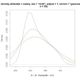
# KDE plots of salary data with varying bandwidth selections using the 'adjust'
# option
# PROGRAM NAME: KDE_R
# DATE: 6/18/2010
# AUTHOR : MATT BOGARD
# PURPOSE: EXAMPLE OF KERNAL DENSITY ESTIMATES IN R
# DATA USED: SIMULATED WITHIN SCRIPT
# PACKAGES: lattice Hmisc
# OUTPUT FILE: "C:\Documents and Settings\wkuuser\My Documents\TOOLS AND REFERENCES\R References"
# UPDATES:
#
#
# COMMENTS: GIVE A BASIC UNDERSTANDING OF THE density() FUNCTION IN R
# AND BANDWIDTH, KERNAL SELECTION, AND PLOTTING
#
# REFERENCES: ADAPTED FROM
# http://ise.tamu.edu/metrology/Group%20Seminars/Kernel_Density_Estimation_2008JUN27_2.pdf
#
# CONTENTS: PART1 EXAMPLES USING CODE GENERATED NORMALLY DISTRIBUTED DATA
# PART2 EXAMPLES USING SAMPLE DATA
#---------------------------------------------------------------#
# PART1 EXAMPLES USING CODE GENERATED NORMALLY DISTRIBUTED DATA
#---------------------------------------------------------------#
x <- seq(-4, 4, 0.01) y <- dnorm(x, mean=0, sd=1 # create x,y data set that is exactly normal
rn <- rnorm(1000, mean=0, sd=1 # create a set of random normal values
# plot the density of the random numbers you just generated
# let the bandwidth = nrd0 "rule of thub" h= .9*A*n*exp(-1.5), A = min{s,IQR/1.34}
# select the gaussian kernal using 1000 points (which you just generated)
plot(density(x=rn, bw="nrd0", kernel="gaussian", n=1000), col=5) # gaussian is default
lines(x, y) # plot the exactly normal data set you created earlier to compare
# plot a series of KDE plots with varying bandwitdth using 'width='option
# When this option is specified instead of 'bw',and is a number, the density
# function bandwidth is set to a kernel dependent multiple of 'width'
for(w in 1:3)
lines(density(x=rn, width=w, kernel="gaussian", n=1000), col=w+1)
# what if we change the kernal
# first close the graphics window to start over
# look at varius bandwidths using a kernal other than gaussian
# KDE otpions:
# gaussian rectangular triangular
# biweight cosine optcosine"
# epanechnikov
plot(density(x=rn, bw="nrd0", kernel="rectangular", n=1000), col=1)
for(w in 1:3)
lines(density(x=rn, width=w, kernel="rectangular", n=1000), col=w+1)
# or to just look at various densities in one plot
# using a lines statment specifying the specific kernal
plot(density(x=rn, bw="nrd0", kernel="gaussian", n=1000), col=1)
lines(density(x=rn, bw="nrd0", kernel="rectangular", n=1000), col=2)
lines(density(x=rn, bw="nrd0", kernel="triangular", n=1000), col=3)
lines(density(x=rn, bw="nrd0", kernel="epanechnikov", n=1000), col=4)
lines(density(x=rn, bw="nrd0", kernel="biweight", n=1000), col=5)
lines(density(x=rn, bw="nrd0", kernel="cosine", n=1000), col=6)
lines(density(x=rn, bw="nrd0", kernel="optcosine", n=1000), col=7)
# or to just look at various densities in one plot
# using a lines statment specifying the specific kernal
plot(density(x=rn, bw="nrd0", kernel="gaussian", n=1000), col=1)
# note if you want the default gaussian, it does not have to be specified
plot(density(x=rn, bw="nrd0", n=1000), col=1)
#-----------------------------------#
# PART2 EXAMPLES USING SAMPLE DATA
#-----------------------------------#
# load salary data
salary<-c(240,240,240,240,240,240,240,240,255,255,265,265,280,280,290,300,305,325,330,340)
print(salary)
library(Hmisc) # load for describe function
describe(salary) # general stats
library(lattice) # load lattice package for histogram graphics
hs <- hist(salary) # plot histogram and store data
print(hs)
# create a kde of salary data (gaussian)and store it as dens
dens <- density(x=salary, bw="nrd0", n=20)
print(dens)
rs <- max(hs$counts/max(dens$y)) # create scaling factor for plotting the density
lines(dens$x, dens$y*rs, col=2) # plot density over histogram using lines statment
# compare this to just plotting the non-rescaled density over the histogram
lines(density(x=salary, bw="nrd0", n=20),col=3) # green line barely shows up
# also, compare to just plotting the estimated density for the sample
# data in a separate plot
plot(density(x=salary, bw="nrd0", n=20)) # or equivalently
plot(dens, col=3)
# now that we understand the various ways we can plot a specified KDE
# we can apply the tools used in part 1 to look at the effects of
# various bandwidths and kernal choices - first close the graphing window
# what if we change the kernal
# first close the graphics window to start over
# look at varius KDEs
# KDE otpions:
# gaussian rectangular triangular
# biweight cosine optcosine"
# epanechnikov
# look at various densities in one plot
# using a lines statment specifying the specific kernal
plot(density(x=salary, bw="nrd0", kernel="gaussian", n=20), col=1)
lines(density(x=salary, bw="nrd0", kernel="rectangular", n=20), col=2)
lines(density(x=salary, bw="nrd0", kernel="triangular", n=20), col=3)
lines(density(x=salary, bw="nrd0", kernel="epanechnikov", n=20), col=4)
lines(density(x=salary, bw="nrd0", kernel="biweight", n=20), col=5)
lines(density(x=salary, bw="nrd0", kernel="cosine", n=20), col=6)
lines(density(x=salary, bw="nrd0", kernel="optcosine", n=20), col=7)
# what if we don't specify a bandwidth (clear graphics window)
# what is the default density
plot(density(x=salary, bw="nrd0", kernel="gaussian", n=20), col=1)
lines(density(x=salary, kernel="gaussian", n=20), col=2)# nrd0 appears to be default
# what if we change the default
# nrd (a variation of nrd0)
# ucv (unbiased cross validation)
# bcv (cross validation)
lines(density(x=salary, bw="ucv", kernel="gaussian", n=20), col=2)
lines(density(x=salary, bw="bcv", kernel="gaussian", n=20), col=3)
lines(density(x=salary, bw="nrd", kernel="gaussian", n=20), col=4)
# use print option to see how the bw value changes with each method
print(density(x=salary, bw="nrd0", kernel="gaussian", n=20))
# look at the differences in calculated
# bandwidth and plots with the adjust option
for(w in 1:3)
print(density(x=salary, bw="nrd0", adjust=w, kernel="gaussian", n=20))
plot(density(x=salary, bw="nrd0",adjust=1, kernel="gaussian", n=20), col=1)
lines(density(x=salary, bw="nrd0",adjust=2,kernel="gaussian", n=20), col=2)
lines(density(x=salary, bw="nrd0",adjust=3,kernel="gaussian", n=20), col=3)
# notepad or the R scripting window and it should line up
# This program is a little more complicated than the previous ones,and some of
# the topics may be a little out of the scope of this class, but if you
# are interested and don't understand something let me know
# example plots from Part 2 of the program using sample salary data:
# histogram of salary data with gaussian KDE plot

# KDE plots of salary data with varying bandwidth selections using the 'adjust'
# option

# PROGRAM NAME: KDE_R
# DATE: 6/18/2010
# AUTHOR : MATT BOGARD
# PURPOSE: EXAMPLE OF KERNAL DENSITY ESTIMATES IN R
# DATA USED: SIMULATED WITHIN SCRIPT
# PACKAGES: lattice Hmisc
# OUTPUT FILE: "C:\Documents and Settings\wkuuser\My Documents\TOOLS AND REFERENCES\R References"
# UPDATES:
#
#
# COMMENTS: GIVE A BASIC UNDERSTANDING OF THE density() FUNCTION IN R
# AND BANDWIDTH, KERNAL SELECTION, AND PLOTTING
#
# REFERENCES: ADAPTED FROM
# http://ise.tamu.edu/metrology/Group%20Seminars/Kernel_Density_Estimation_2008JUN27_2.pdf
#
# CONTENTS: PART1 EXAMPLES USING CODE GENERATED NORMALLY DISTRIBUTED DATA
# PART2 EXAMPLES USING SAMPLE DATA
#---------------------------------------------------------------#
# PART1 EXAMPLES USING CODE GENERATED NORMALLY DISTRIBUTED DATA
#---------------------------------------------------------------#
x <- seq(-4, 4, 0.01) y <- dnorm(x, mean=0, sd=1 # create x,y data set that is exactly normal
rn <- rnorm(1000, mean=0, sd=1 # create a set of random normal values
# plot the density of the random numbers you just generated
# let the bandwidth = nrd0 "rule of thub" h= .9*A*n*exp(-1.5), A = min{s,IQR/1.34}
# select the gaussian kernal using 1000 points (which you just generated)
plot(density(x=rn, bw="nrd0", kernel="gaussian", n=1000), col=5) # gaussian is default
lines(x, y) # plot the exactly normal data set you created earlier to compare
# plot a series of KDE plots with varying bandwitdth using 'width='option
# When this option is specified instead of 'bw',and is a number, the density
# function bandwidth is set to a kernel dependent multiple of 'width'
for(w in 1:3)
lines(density(x=rn, width=w, kernel="gaussian", n=1000), col=w+1)
# what if we change the kernal
# first close the graphics window to start over
# look at varius bandwidths using a kernal other than gaussian
# KDE otpions:
# gaussian rectangular triangular
# biweight cosine optcosine"
# epanechnikov
plot(density(x=rn, bw="nrd0", kernel="rectangular", n=1000), col=1)
for(w in 1:3)
lines(density(x=rn, width=w, kernel="rectangular", n=1000), col=w+1)
# or to just look at various densities in one plot
# using a lines statment specifying the specific kernal
plot(density(x=rn, bw="nrd0", kernel="gaussian", n=1000), col=1)
lines(density(x=rn, bw="nrd0", kernel="rectangular", n=1000), col=2)
lines(density(x=rn, bw="nrd0", kernel="triangular", n=1000), col=3)
lines(density(x=rn, bw="nrd0", kernel="epanechnikov", n=1000), col=4)
lines(density(x=rn, bw="nrd0", kernel="biweight", n=1000), col=5)
lines(density(x=rn, bw="nrd0", kernel="cosine", n=1000), col=6)
lines(density(x=rn, bw="nrd0", kernel="optcosine", n=1000), col=7)
# or to just look at various densities in one plot
# using a lines statment specifying the specific kernal
plot(density(x=rn, bw="nrd0", kernel="gaussian", n=1000), col=1)
# note if you want the default gaussian, it does not have to be specified
plot(density(x=rn, bw="nrd0", n=1000), col=1)
#-----------------------------------#
# PART2 EXAMPLES USING SAMPLE DATA
#-----------------------------------#
# load salary data
salary<-c(240,240,240,240,240,240,240,240,255,255,265,265,280,280,290,300,305,325,330,340)
print(salary)
library(Hmisc) # load for describe function
describe(salary) # general stats
library(lattice) # load lattice package for histogram graphics
hs <- hist(salary) # plot histogram and store data
print(hs)
# create a kde of salary data (gaussian)and store it as dens
dens <- density(x=salary, bw="nrd0", n=20)
print(dens)
rs <- max(hs$counts/max(dens$y)) # create scaling factor for plotting the density
lines(dens$x, dens$y*rs, col=2) # plot density over histogram using lines statment
# compare this to just plotting the non-rescaled density over the histogram
lines(density(x=salary, bw="nrd0", n=20),col=3) # green line barely shows up
# also, compare to just plotting the estimated density for the sample
# data in a separate plot
plot(density(x=salary, bw="nrd0", n=20)) # or equivalently
plot(dens, col=3)
# now that we understand the various ways we can plot a specified KDE
# we can apply the tools used in part 1 to look at the effects of
# various bandwidths and kernal choices - first close the graphing window
# what if we change the kernal
# first close the graphics window to start over
# look at varius KDEs
# KDE otpions:
# gaussian rectangular triangular
# biweight cosine optcosine"
# epanechnikov
# look at various densities in one plot
# using a lines statment specifying the specific kernal
plot(density(x=salary, bw="nrd0", kernel="gaussian", n=20), col=1)
lines(density(x=salary, bw="nrd0", kernel="rectangular", n=20), col=2)
lines(density(x=salary, bw="nrd0", kernel="triangular", n=20), col=3)
lines(density(x=salary, bw="nrd0", kernel="epanechnikov", n=20), col=4)
lines(density(x=salary, bw="nrd0", kernel="biweight", n=20), col=5)
lines(density(x=salary, bw="nrd0", kernel="cosine", n=20), col=6)
lines(density(x=salary, bw="nrd0", kernel="optcosine", n=20), col=7)
# what if we don't specify a bandwidth (clear graphics window)
# what is the default density
plot(density(x=salary, bw="nrd0", kernel="gaussian", n=20), col=1)
lines(density(x=salary, kernel="gaussian", n=20), col=2)# nrd0 appears to be default
# what if we change the default
# nrd (a variation of nrd0)
# ucv (unbiased cross validation)
# bcv (cross validation)
lines(density(x=salary, bw="ucv", kernel="gaussian", n=20), col=2)
lines(density(x=salary, bw="bcv", kernel="gaussian", n=20), col=3)
lines(density(x=salary, bw="nrd", kernel="gaussian", n=20), col=4)
# use print option to see how the bw value changes with each method
print(density(x=salary, bw="nrd0", kernel="gaussian", n=20))
# look at the differences in calculated
# bandwidth and plots with the adjust option
for(w in 1:3)
print(density(x=salary, bw="nrd0", adjust=w, kernel="gaussian", n=20))
plot(density(x=salary, bw="nrd0",adjust=1, kernel="gaussian", n=20), col=1)
lines(density(x=salary, bw="nrd0",adjust=2,kernel="gaussian", n=20), col=2)
lines(density(x=salary, bw="nrd0",adjust=3,kernel="gaussian", n=20), col=3)
Thursday, April 29, 2010
Standard Normal Distribution & Z-values
############################################
# Below is R code for plotting normal distributions - illustrating
# the changes in the distribution when standard deviation changes.
# -selected graphics are imbedded below
#
# Also calculates area under the normal curve for given Z
#
# Finally plots 3-D bivariate normal density
#
#############################################
# PROGRAM NAME: NORMAL_PLOT_R
#
# ECON 206
#
# ORIGINAL SOURCE: The Standard Normal Distribution in R:
# http://msenux.redwoods.edu/math/R/StandardNormal.php
#
#
#
#
#PLOT NORMAL DENSISTY
x=seq(-4,4,length=200)
y=dnorm(x,mean=0,sd=1)
plot(x,y,type="l",lwd=2,col="red")
#######################################

###################################
# INCREASE THE STANDARD DEVIATION
x=seq(-4,4,length=200)
y=dnorm(x,mean=0,sd=2.5)
plot(x,y,type="l",lwd=2,col="red")
#####################################

####################################
# DECREASE THE STANDARD DEVIATION
x=seq(-4,4,length=200)
y=dnorm(x,mean=0,sd=.5)
plot(x,y,type="l",lwd=2,col="red")
# CALCULATING AREA FOR GIVEN Z-VALUES
# RECALL, FOR THE STANDARD NORMAL DISTRIBUTION THE MEAN = 0 AND
# THE STANDARD DEVIATION = 1
# THE pnorm FUNCTION GIVES THE PROBABILITY FOR THE AREA TO THE LEFT
# OF THE SPECIFIED Z-VALUE ( THE FIRST VALUE ENTERED IN THE FUNCTION)
# THE OUTPUT SHOULD MATCH WHAT YOU GET FROM THE NORMAL TABLE IN YOUR BOOK
# OR THE HANDOUT I SENT YOU
pnorm(0,mean=0, sd=1) # Z =0
pnorm(1,mean=0, sd=1) # Z <= 1
pnorm(1.55, mean=0, sd=1) # Z<=1.55
pnorm(1.645, mean=0, sd=1) # Z<= 1.645
# LETS LOOK AT A BIVARIATE NORMAL
# DISTRIBUTION
# first simulate a bivariate normal sample
library(MASS)
bivn <- mvrnorm(1000, mu = c(0, 0), Sigma = matrix(c(1, 0, 0, 1), 2))
# now we do a kernel density estimate
bivn.kde <- kde2d(bivn[,1], bivn[,2], n = 100)
# now plot your results
contour(bivn.kde)
image(bivn.kde)
persp(bivn.kde, phi = 45, theta = 30)
# fancy contour with image
image(bivn.kde); contour(bivn.kde, add = T)
# fancy perspective
persp(bivn.kde, phi = 45, theta = 30, shade = .1, border = NA)
###############################################

# Below is R code for plotting normal distributions - illustrating
# the changes in the distribution when standard deviation changes.
# -selected graphics are imbedded below
#
# Also calculates area under the normal curve for given Z
#
# Finally plots 3-D bivariate normal density
#
#############################################
# PROGRAM NAME: NORMAL_PLOT_R
#
# ECON 206
#
# ORIGINAL SOURCE: The Standard Normal Distribution in R:
# http://msenux.redwoods.edu/math/R/StandardNormal.php
#
#
#
#
#PLOT NORMAL DENSISTY
x=seq(-4,4,length=200)
y=dnorm(x,mean=0,sd=1)
plot(x,y,type="l",lwd=2,col="red")
#######################################

###################################
# INCREASE THE STANDARD DEVIATION
x=seq(-4,4,length=200)
y=dnorm(x,mean=0,sd=2.5)
plot(x,y,type="l",lwd=2,col="red")
#####################################

####################################
# DECREASE THE STANDARD DEVIATION
x=seq(-4,4,length=200)
y=dnorm(x,mean=0,sd=.5)
plot(x,y,type="l",lwd=2,col="red")
# CALCULATING AREA FOR GIVEN Z-VALUES
# RECALL, FOR THE STANDARD NORMAL DISTRIBUTION THE MEAN = 0 AND
# THE STANDARD DEVIATION = 1
# THE pnorm FUNCTION GIVES THE PROBABILITY FOR THE AREA TO THE LEFT
# OF THE SPECIFIED Z-VALUE ( THE FIRST VALUE ENTERED IN THE FUNCTION)
# THE OUTPUT SHOULD MATCH WHAT YOU GET FROM THE NORMAL TABLE IN YOUR BOOK
# OR THE HANDOUT I SENT YOU
pnorm(0,mean=0, sd=1) # Z =0
pnorm(1,mean=0, sd=1) # Z <= 1
pnorm(1.55, mean=0, sd=1) # Z<=1.55
pnorm(1.645, mean=0, sd=1) # Z<= 1.645
# LETS LOOK AT A BIVARIATE NORMAL
# DISTRIBUTION
# first simulate a bivariate normal sample
library(MASS)
bivn <- mvrnorm(1000, mu = c(0, 0), Sigma = matrix(c(1, 0, 0, 1), 2))
# now we do a kernel density estimate
bivn.kde <- kde2d(bivn[,1], bivn[,2], n = 100)
# now plot your results
contour(bivn.kde)
image(bivn.kde)
persp(bivn.kde, phi = 45, theta = 30)
# fancy contour with image
image(bivn.kde); contour(bivn.kde, add = T)
# fancy perspective
persp(bivn.kde, phi = 45, theta = 30, shade = .1, border = NA)
###############################################

Sunday, April 25, 2010
Basic Regression in R
#
# COMMENTS: BASIC INTRODUCTION TO REGRESSION USING R
#
#
# WILLIAMS P 572 #1
#
# GET DATA
x<-c(1,2,3,4,5)
y<-c(3,7,5,11,14)
# PLOT DATA
plot(x,y)
reg1 <- lm(y~x) # COMPUTE REGRESSION ESTIMATES
summary(reg1) # PRINT OUTPUT
abline(reg1) # PLOT REGRESSION LINE
#
# SCHAUM'S P. 274 #14.2
#
#GET DATA
x<-c(20,16,34,23,27,32,18,22)
y<-c(64,61,84,70,88,92,72,77)
plot(x,y) #PLOT DATA
reg1 <- lm(y~x) # COMPUTE REGRESSION ESTIMATES
summary(reg1) # PRINT OUTPUT
abline(reg1) # PLOT REGRESSION LINE
# COMMENTS: BASIC INTRODUCTION TO REGRESSION USING R
#
#
# WILLIAMS P 572 #1
#
# GET DATA
x<-c(1,2,3,4,5)
y<-c(3,7,5,11,14)
# PLOT DATA
plot(x,y)
reg1 <- lm(y~x) # COMPUTE REGRESSION ESTIMATES
summary(reg1) # PRINT OUTPUT
abline(reg1) # PLOT REGRESSION LINE
#
# SCHAUM'S P. 274 #14.2
#
#GET DATA
x<-c(20,16,34,23,27,32,18,22)
y<-c(64,61,84,70,88,92,72,77)
plot(x,y) #PLOT DATA
reg1 <- lm(y~x) # COMPUTE REGRESSION ESTIMATES
summary(reg1) # PRINT OUTPUT
abline(reg1) # PLOT REGRESSION LINE
Social Network Analysis of Tweets Using R
This past week I attended the AACRAO conference in New Orleans. This provided a great opportunity to demonstrate one of the many things you can do wit R. ( for more about the R statistical programming language see here) R is capable of many outside the box applications (beyond just the basic statistical techniques) such as social network analysis.
The image below represents the network of the last 100 tweets using the hashtag #aacrao10. The data was captured and the network was constructed using R. Thanks to Drew Conway for showing me how to do this.
(Click to enlarge)

Labeled dots indicate users that used the specified hashtag while unlabeled dots indicate 'friends' of users that used the specified hashtag.The code also allows you to compute important network metrics such as measures of centrality that are helpful in key actor analysis.
The image below represents the network of the last 100 tweets using the hashtag #aacrao10. The data was captured and the network was constructed using R. Thanks to Drew Conway for showing me how to do this.
(Click to enlarge)

Labeled dots indicate users that used the specified hashtag while unlabeled dots indicate 'friends' of users that used the specified hashtag.The code also allows you to compute important network metrics such as measures of centrality that are helpful in key actor analysis.
Monday, February 1, 2010
R Code for Sample Statistics Problesm
#################################################
# SELECTED PRACTICE PROBLEMS USING R -SCHAUMS
#################################################
# P.49-50
# 3.1
sales<-c(.10,.10,.25,.25,.25,.35,.40,.53,.90,1.25,1.35,2.45,2.71,3.09,4.10)
summary(sales)
sum(sales)
#3.5
salary<-c(240,240,240,240,240,240,240,240,255,255,265,265,280,280,290,300,305,325,330,340)
sum(salary)# just to check your work done by hand
summary(salary)
#---------------------------------
# EXAMPLE OF HISTOGRAM
#---------------------------------
library(lattice)# graphing package
hist(salary) # graph histogram
d <- density(salary) # fit curve to data
plot(d) # plot curve
# 4.9
minutes<-c(5,5,5,7,9,14,15,15,16,18)
print(minutes)
summary(minutes)
var(minutes)
sd(minutes)
library(lattice) # for graphics,but not necessary if previously loaded
hist(minutes)
d<-density(minutes)
plot(d)
#4.24
weights<-c(21,18,30,12,14,17,28,10,16,25)
sum(weights)
summary(weights)
sum(weights*weights) gives sum of X squared
var(weights)
sd(weights)
#4.33
cars<-c(2,4,7,10,10,10,12,12,14,15)
print(cars)
sum(cars)
summary(cars)
sum(cars*cars)
var(cars)
sd(cars)
(4.16866/9.6)*100 #co-efficient of variation
#################################################
# SELECTED PRACTICE PROBLEMS USING R -WILLIAMS
#################################################
#P.107
#1a
sample<-c(10,20,12,17,16)
print(sample)
summary(sample)
#2a
sample<-c(10,20,21,17,16,12)
print(sample)
summary(sample)
#p.151
#61
loans<-c(10.1,14.8,5,10.2,12.4,12.2,2,11.5,17.8,4)
print(loans)
sum(loans)
summary(loans)
sum(loans^2)
var(loans)
sd(loans)
#63
public<-c(28,29,32,37,33,25,29,32,41,34)
print(public)
sum(public)
summary(public)
sum(public^2)
var(public)
sd(public)
(4.64/32)*100 #CV
auto<-c(29,31,33,32,34,30,31,32,35,33)
print(auto)
sum(auto)
summary(auto)
sum(auto^2)
var(auto)
sd(auto)
(1.83/3.33)*100 #CV
# SELECTED PRACTICE PROBLEMS USING R -SCHAUMS
#################################################
# P.49-50
# 3.1
sales<-c(.10,.10,.25,.25,.25,.35,.40,.53,.90,1.25,1.35,2.45,2.71,3.09,4.10)
summary(sales)
sum(sales)
#3.5
salary<-c(240,240,240,240,240,240,240,240,255,255,265,265,280,280,290,300,305,325,330,340)
sum(salary)# just to check your work done by hand
summary(salary)
#---------------------------------
# EXAMPLE OF HISTOGRAM
#---------------------------------
library(lattice)# graphing package
hist(salary) # graph histogram
d <- density(salary) # fit curve to data
plot(d) # plot curve
# 4.9
minutes<-c(5,5,5,7,9,14,15,15,16,18)
print(minutes)
summary(minutes)
var(minutes)
sd(minutes)
library(lattice) # for graphics,but not necessary if previously loaded
hist(minutes)
d<-density(minutes)
plot(d)
#4.24
weights<-c(21,18,30,12,14,17,28,10,16,25)
sum(weights)
summary(weights)
sum(weights*weights) gives sum of X squared
var(weights)
sd(weights)
#4.33
cars<-c(2,4,7,10,10,10,12,12,14,15)
print(cars)
sum(cars)
summary(cars)
sum(cars*cars)
var(cars)
sd(cars)
(4.16866/9.6)*100 #co-efficient of variation
#################################################
# SELECTED PRACTICE PROBLEMS USING R -WILLIAMS
#################################################
#P.107
#1a
sample<-c(10,20,12,17,16)
print(sample)
summary(sample)
#2a
sample<-c(10,20,21,17,16,12)
print(sample)
summary(sample)
#p.151
#61
loans<-c(10.1,14.8,5,10.2,12.4,12.2,2,11.5,17.8,4)
print(loans)
sum(loans)
summary(loans)
sum(loans^2)
var(loans)
sd(loans)
#63
public<-c(28,29,32,37,33,25,29,32,41,34)
print(public)
sum(public)
summary(public)
sum(public^2)
var(public)
sd(public)
(4.64/32)*100 #CV
auto<-c(29,31,33,32,34,30,31,32,35,33)
print(auto)
sum(auto)
summary(auto)
sum(auto^2)
var(auto)
sd(auto)
(1.83/3.33)*100 #CV
Sunday, January 31, 2010
R Code for Basic Histograms
#####################################################
## THIS IS A LITTLE MORE STRAIGHT FORWARD THAN THE ##
## THE OTHER EXAMPLE- USING A SIMPLE DATA SET READ ##
## DIRECTLY FROM R VS. A FILE OR WEB ##
#####################################################
#----------------------------------------#
# SCHAUM'S P. 49 3.5 SALARY DATA
# BASIC HISTOGRAM
#----------------------------------------#
# LOAD SALARY DATA INTO VARIABLE SALARY
salary<-c(240,240,240,240,240,240,240,240,255,255,265,265,280,280,290,300,305,325,330,340) print(salary) # SEE IF IT IS CORRECT library(lattice) # LOAD THE REQUIRED lattice PACKAGE FOR GRAPHICS hist(salary) # PRODUCE THE HISTOGRAM # SEE OUTPUT BELOW
#---------------------------------------
# HISTOGRAM OPTIONS FOR COLOR ETC.
#----------------------------------------
hist(salary, breaks=6, col="blue") # MANIPULATE THE # OF BREAKS AND COLOR
# CHANGE TITLE AND X-AXIS LABEL
hist(salary, breaks=6, col="blue", xlab ="Weekly Salary", main ="Distribution of Salary")
#-------------------------------------------------
# FIT A SMOOTH CURVE TO THE DATA- KERNAL DENSITY
#-------------------------------------------------
d <- density(salary) # CREATE A DENSITY CURVE TO FIT THE DATA
plot(d) # PLOT THE CURVE
plot(d, main="Kernal Density Distribution of Salary") # ADD TITLE
polygon(d, col="yellow", border="blue") # ADD COLOR
## THIS IS A LITTLE MORE STRAIGHT FORWARD THAN THE ##
## THE OTHER EXAMPLE- USING A SIMPLE DATA SET READ ##
## DIRECTLY FROM R VS. A FILE OR WEB ##
#####################################################
#----------------------------------------#
# SCHAUM'S P. 49 3.5 SALARY DATA
# BASIC HISTOGRAM
#----------------------------------------#
# LOAD SALARY DATA INTO VARIABLE SALARY
salary<-c(240,240,240,240,240,240,240,240,255,255,265,265,280,280,290,300,305,325,330,340) print(salary) # SEE IF IT IS CORRECT library(lattice) # LOAD THE REQUIRED lattice PACKAGE FOR GRAPHICS hist(salary) # PRODUCE THE HISTOGRAM # SEE OUTPUT BELOW

#---------------------------------------
# HISTOGRAM OPTIONS FOR COLOR ETC.
#----------------------------------------
hist(salary, breaks=6, col="blue") # MANIPULATE THE # OF BREAKS AND COLOR
# CHANGE TITLE AND X-AXIS LABEL
hist(salary, breaks=6, col="blue", xlab ="Weekly Salary", main ="Distribution of Salary")
#-------------------------------------------------
# FIT A SMOOTH CURVE TO THE DATA- KERNAL DENSITY
#-------------------------------------------------
d <- density(salary) # CREATE A DENSITY CURVE TO FIT THE DATA
plot(d) # PLOT THE CURVE
plot(d, main="Kernal Density Distribution of Salary") # ADD TITLE
polygon(d, col="yellow", border="blue") # ADD COLOR
Saturday, January 30, 2010
R Code for Mean, Variance, and Standard Deviation
##################################################
## REMEMBER, THIS IS ONLY THOSE INTERESTED IN R
## YOU ARE NOT REQUIRED TO UNDERSTAND THIS CODE
## WE WILL WORK THROUGH THIS IN CLASS ON THE BOARD
## AND IN EXCEL
##################################################
#---------------------------------#
# DEMONSTRATE MEAN AND VARIANCE #
#---------------------------------#
###################################
# DATA: Corn Yields
#
# Garst: 148 150 152 146 154
#
# Pioneer: 150 175 120 140 165
###################################
# compute descriptive statistics for Garst corn yields
garst<-c(148, 150, 152, 146, 154) # enter values for 'garst'
print(garst) # see if the data is there
summary(garst) # this gives the mean, median, min, max Q1,Q3
var(garst) # compute variance
sd(garst) # compute standard deviation
plot(garst)
# compute descriptive statistics for Pioneer Corn Yields
pioneer<-c(150, 175, 120, 140, 165)
print(pioneer)
summary(pioneer)
var(pioneer)
sd(pioneer)
plot(pioneer)
## REMEMBER, THIS IS ONLY THOSE INTERESTED IN R
## YOU ARE NOT REQUIRED TO UNDERSTAND THIS CODE
## WE WILL WORK THROUGH THIS IN CLASS ON THE BOARD
## AND IN EXCEL
##################################################
#---------------------------------#
# DEMONSTRATE MEAN AND VARIANCE #
#---------------------------------#
###################################
# DATA: Corn Yields
#
# Garst: 148 150 152 146 154
#
# Pioneer: 150 175 120 140 165
###################################
# compute descriptive statistics for Garst corn yields
garst<-c(148, 150, 152, 146, 154) # enter values for 'garst'
print(garst) # see if the data is there
summary(garst) # this gives the mean, median, min, max Q1,Q3
var(garst) # compute variance
sd(garst) # compute standard deviation
plot(garst)
# compute descriptive statistics for Pioneer Corn Yields
pioneer<-c(150, 175, 120, 140, 165)
print(pioneer)
summary(pioneer)
var(pioneer)
sd(pioneer)
plot(pioneer)
Wednesday, January 27, 2010
APPLICATIONS USING R
While we will primarily rely on Excel to do your empirical projects and for examples in class, if you have an interest in programming, I encourage you to explore the free statistical programming language R.
The links below highlight applications of the R programming language. Some of these are far more advanced than what we will address in class, and some don't necessarily involve statistics-but I share them with you to illustrate how flexible the language can be for a number of things. Learning to use R for statistics is a great way to get started. If you are interested in learning more, please don't hesitate to contact me.
Visualizing Taxes and Deficits Using R and Google Visualization API
R in the New York Times
How to integrate R into web-based applications (video) using Rapache
Using Social Network Analysis to Analyze Tweets with R
The links below highlight applications of the R programming language. Some of these are far more advanced than what we will address in class, and some don't necessarily involve statistics-but I share them with you to illustrate how flexible the language can be for a number of things. Learning to use R for statistics is a great way to get started. If you are interested in learning more, please don't hesitate to contact me.
Visualizing Taxes and Deficits Using R and Google Visualization API
R in the New York Times
How to integrate R into web-based applications (video) using Rapache
Using Social Network Analysis to Analyze Tweets with R
Tuesday, January 5, 2010
R Statistical Software Links
Using R in the Real World
Why use R Statistical Software?
Google's R Style Guide - Set up for Google's corporate programmers
UCLA R Resources
Statistical Computing with R: A Tutorial (Illinois State University)
(UCLA R Class Notes) -great example code for getting started with R
Quick R (Statistics Guide)
R-Project ( Where you go to get R software Free)
SAS-R Blog
Using R for Introductory Statistics (John Verzani)
Why use R Statistical Software?
Google's R Style Guide - Set up for Google's corporate programmers
UCLA R Resources
Statistical Computing with R: A Tutorial (Illinois State University)
(UCLA R Class Notes) -great example code for getting started with R
Quick R (Statistics Guide)
R-Project ( Where you go to get R software Free)
SAS-R Blog
Using R for Introductory Statistics (John Verzani)
Creating a Histogram In R
# READ DATA SET CALLED 'hs0' from Web:
hs0 <- read.table("http://www.ats.ucla.edu/stat/R/notes/hs0.csv", header=T, sep=",")
attach(hs0)
# Or if you have downloaded the data set to your desktop:
hs0 <- read.table("C:\\Documents and Settings\\wkuuser\\Desktop\\hs0.csv", header=T, sep=",")
attach(hs0)
# print summary of first 20 observations to see what the data looks like
hs0[1:20, ]
# CREATE HISTOGRAM FOR VARIABLE 'write'
library(lattice)
hist(write)
hs0 <- read.table("http://www.ats.ucla.edu/stat/R/notes/hs0.csv", header=T, sep=",")
attach(hs0)
# Or if you have downloaded the data set to your desktop:
hs0 <- read.table("C:\\Documents and Settings\\wkuuser\\Desktop\\hs0.csv", header=T, sep=",")
attach(hs0)
# print summary of first 20 observations to see what the data looks like
hs0[1:20, ]
# CREATE HISTOGRAM FOR VARIABLE 'write'
library(lattice)
hist(write)
Why use R Statistical Software
From: http://datamining.togaware.com/survivor/Pros_Cons.html
*R is the most comprehensive statistical analysis package available. It incorporates all of the standard statistical tests, models, analyses, as well as providing a comprehensive language for managing and manipulating data.
* R is a programming language and environment developed for statistical analysis by practising statisticians and researchers.
* R is developed by a core team of some 10 developers, including some of the worlds leading Statisticians.
* The validity of the R software is ensured through openly validated and comprehensive governance as documented for the American Food and Drug Authority in XXXX. Because R is open source, unlike commercial software, R has been reviewed by many internationally renowned statisticians and computational scientists.
* R has over 1400 packages available specialising in topics like from Econometrics, Data Mining, Spatial Analysis, Bio-Informatics.
* R is free and open source software allowing anyone to use and, importantly, to modify it. R is licensed under the GNU General Public License, with Copyright held by The R Foundation for Statistical Computing.
* Anyone can freely download and install the R software and even freely modify the software, or look at the code behind the software to learn how things are done.
* Anyone is welcome to provide bug fixes, code enhancements, and new packages, and the wealth of quality packages available for R is a testament to this approach to software development and sharing.
* R well integrates packages in different languages, including Java (hence the Rpackage[]RWeka package), Fortran (hence Rpackage[]randomForest), C (hence Rpackage[]arules), C++, and Python.
* The R command line is much more powerful than a graphical user interface.
* R is cross platform. R runs on many operating systems and different hardware. It is popularly used on GNU/Linux, Macintosh, and MW/Windows, running on both 32bit and 64bit processors.
* R has active user groups where questions can be asked and are often quickly responded to, and often responded to by the very people who have developed the environment--this support is second to none. Have you ever tried getting support from people who really know SAS or are core developers of SAS?
* New books for R (the Springer Use R! series) are emerging and there will soon be a very good library of books for using R.
* No license restrictions (other than ensuring our freedom to use it at our own discretion) and so you can run R anywhere and at any time.
* R probably has the most complete collection of statistical functions of any statistical or data mining package. New technology and ideas often appear first in R.
* The graphic capabilities of R are outstanding, providing a fully programmable graphics language which surpasses most other statistical and graphical packages.
* A very active email list, with some of the worlds leading statisticians actively responding, is available for anyone to join. Questions are quickly answered and the archive provides a wealth of user solutions and examples. Be sure to read the Posting Guide first.
* Being open source the R source code is peer reviewed, and anyone is welcome to review it and suggest improvements. Bugs are fixed very quickly. Consequently, R is a rock solid product. New packages provided with R do go through a life cycle, often beginning as somewhat less quality tools, but usually quickly evolving into top quality products.
* R plays well with many other tools, importing data, for example, from CSV files, SAS, and SPSS, or directly from MS/Excel, MS/Access, Oracle, MySQL, and SQLite. It can also produce graphics output in PDF, JPG, PNG, and SVG formats, and table output for LATEX and HTML.
*R is the most comprehensive statistical analysis package available. It incorporates all of the standard statistical tests, models, analyses, as well as providing a comprehensive language for managing and manipulating data.
* R is a programming language and environment developed for statistical analysis by practising statisticians and researchers.
* R is developed by a core team of some 10 developers, including some of the worlds leading Statisticians.
* The validity of the R software is ensured through openly validated and comprehensive governance as documented for the American Food and Drug Authority in XXXX. Because R is open source, unlike commercial software, R has been reviewed by many internationally renowned statisticians and computational scientists.
* R has over 1400 packages available specialising in topics like from Econometrics, Data Mining, Spatial Analysis, Bio-Informatics.
* R is free and open source software allowing anyone to use and, importantly, to modify it. R is licensed under the GNU General Public License, with Copyright held by The R Foundation for Statistical Computing.
* Anyone can freely download and install the R software and even freely modify the software, or look at the code behind the software to learn how things are done.
* Anyone is welcome to provide bug fixes, code enhancements, and new packages, and the wealth of quality packages available for R is a testament to this approach to software development and sharing.
* R well integrates packages in different languages, including Java (hence the Rpackage[]RWeka package), Fortran (hence Rpackage[]randomForest), C (hence Rpackage[]arules), C++, and Python.
* The R command line is much more powerful than a graphical user interface.
* R is cross platform. R runs on many operating systems and different hardware. It is popularly used on GNU/Linux, Macintosh, and MW/Windows, running on both 32bit and 64bit processors.
* R has active user groups where questions can be asked and are often quickly responded to, and often responded to by the very people who have developed the environment--this support is second to none. Have you ever tried getting support from people who really know SAS or are core developers of SAS?
* New books for R (the Springer Use R! series) are emerging and there will soon be a very good library of books for using R.
* No license restrictions (other than ensuring our freedom to use it at our own discretion) and so you can run R anywhere and at any time.
* R probably has the most complete collection of statistical functions of any statistical or data mining package. New technology and ideas often appear first in R.
* The graphic capabilities of R are outstanding, providing a fully programmable graphics language which surpasses most other statistical and graphical packages.
* A very active email list, with some of the worlds leading statisticians actively responding, is available for anyone to join. Questions are quickly answered and the archive provides a wealth of user solutions and examples. Be sure to read the Posting Guide first.
* Being open source the R source code is peer reviewed, and anyone is welcome to review it and suggest improvements. Bugs are fixed very quickly. Consequently, R is a rock solid product. New packages provided with R do go through a life cycle, often beginning as somewhat less quality tools, but usually quickly evolving into top quality products.
* R plays well with many other tools, importing data, for example, from CSV files, SAS, and SPSS, or directly from MS/Excel, MS/Access, Oracle, MySQL, and SQLite. It can also produce graphics output in PDF, JPG, PNG, and SVG formats, and table output for LATEX and HTML.
Subscribe to:
Posts (Atom)
